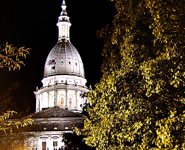
I like the idea, you have the urban with the landscape but the lighting seems blown out on the building, maybe played with the brightness and contrast or hues a little too much? If that is natural lighting from them someone needs to talk to them! Also the building have the tip cut off a little more open cropping on the top. I like the overall balance between the tree and the building.
You should have chosen or for a total top/bottom picture, it is a bit surealistic in coloring and I think you must be a patriotic, greetings doginroom.
Beautiful building and I like how you've included parts of the trees. However, this looks very over saturated and/or over sharpened. I think the natural colors would have looked fine.
These shots are so hard to get the right exposure on. If you meter on the bright area you will underexpose everything else and if you meter on a darker area, you blow the light area.
Woah - is it just me or is this heavily processed? If this is the way it came out of the camera it's quite stunning - I'll give you the benefit of the doubt in my vote.





 Add photograph to your favorites
 Add photographer to your favorites


 Photographer found comment helpful.


