Critique Club Review:
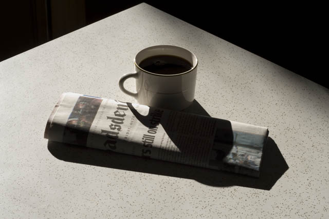
Technical: Focus and depth of field are both very good. Color saturation and hue: Picture is almost black and white, very little color to determine saturation and hue. Picture might work even a little better in black and white, since there is so little color.
Reaction: The picture lacks a little punch. I like the orinetation of the table coming to a point near the edge of the frame. I think I'd like it a little more if the table exited the frame at the two lower corners, making a triangle. Along with the afore mentioned black and white possibility, I think an increase in contrast would work well. Make the shadows black, so that the cup seems almost cut out of the newspaper, and the paper cut out of the table. Steam from the coffee would work well also. I know it is hard to get everything set while the coffee is still hot, but it sure looks like cold coffee at this point.
Overall an interesting picture with a lot of potential. |





 Add photograph to your favorites
 Add photographer to your favorites


