| Author | Thread |
Comments Made During the Challenge  |
|
|
10/10/2006 10:55:47 PM |
|
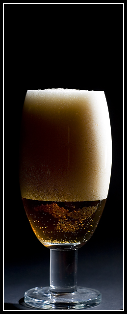
Very nice. I like the lighing. |
|
 Photographer found comment helpful. Photographer found comment helpful. |
|
|
10/10/2006 08:49:32 AM |
|
| Photographer found comment helpful. |
|
|
10/10/2006 04:15:08 AM |
|
| Photographer found comment helpful. |
|
|
10/10/2006 01:34:47 AM |
|
I think a pilsner glass and less head (foam) might have looked more like an advertisement. Grat clarity and lighting! |
|
| Photographer found comment helpful. |
|
|
10/09/2006 11:19:04 PM |
|
| Photographer found comment helpful. |
|
|
10/09/2006 09:45:50 PM |
|
Too much head for my liking! |
|
| Photographer found comment helpful. |
|
|
10/08/2006 05:51:18 AM |
|
I definitely like the crop/compositon and also the lighting.. |
|
| Photographer found comment helpful. |
|
|
10/06/2006 08:49:09 PM |
|
Lighitng is interesting but I wonder if it highlights the product enough. I'd definitely use a beer with less foam. Background color would work well with text. |
|
| Photographer found comment helpful. |
|
|
10/06/2006 05:32:49 AM |
|
I would like a bit more space below |
|
| Photographer found comment helpful. |
|
|
10/05/2006 08:01:43 PM |
|
Simple, yet Powerful! Great idea! :) |
|
| Photographer found comment helpful. |
|
|
10/05/2006 06:07:09 PM |
|
Nice lighting. The negative space at the top doesn't enhance this shot. Cropped landscape would let the eye get more of that nice gradient at the bottom and add some negative space on the sides of the glass where it is needed. Good luck. |
|
| Photographer found comment helpful. |
|
|
10/05/2006 11:51:00 AM |
best i've seen thus far...
Excellent lighting.
minuses:
tight width crop
black space on top
not digging the border |
|
| Photographer found comment helpful. |
|
|
10/04/2006 04:47:08 PM |
|
the lighting on the foam is real good, but the bottom part of the picture is its weak point. maybe a closer crop of just the head? |
|
| Photographer found comment helpful. |
|
|
10/04/2006 03:41:54 PM |
|
| Photographer found comment helpful. |
|
|
10/04/2006 05:36:16 AM |
|
nice light and sharpness...not a fan of the tight crop though |
|
| Photographer found comment helpful. |
|
|
10/04/2006 01:53:51 AM |
|
Seems to need a hint of straightening. Appears to tilt rightward a little. |
|
| Photographer found comment helpful. |
|
|
10/04/2006 01:13:29 AM |
|
Nice. Maybe a little more focused on the bottom of glass... |
|
| Photographer found comment helpful. |
Home -
Challenges -
Community -
League -
Photos -
Cameras -
Lenses -
Learn -
Help -
Terms of Use -
Privacy -
Top ^
DPChallenge, and website content and design, Copyright © 2001-2026 Challenging Technologies, LLC.
All digital photo copyrights belong to the photographers and may not be used without permission.
Current Server Time: 06/29/2026 03:46:30 AM EDT.