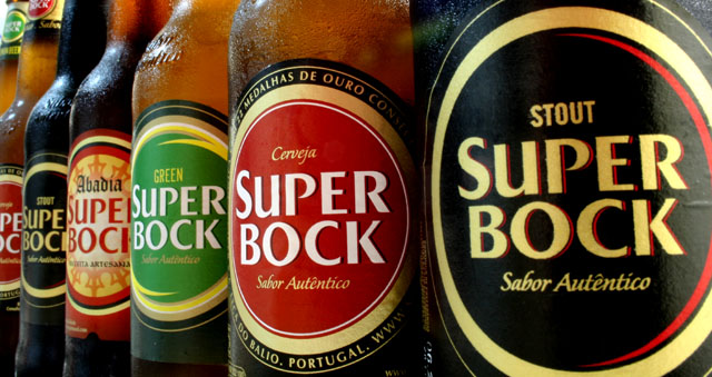
Very nice. I like the lines created by the bottles edges. I also like how the closest bottles label is black as to not distract but to let the vibrant colors on the rest of the bottles lead your eyes down the row. Only thing I could offer would be that the focus is not as sharp on the closest bottle as it is on the second bottle.
I like the choice of colours and perspective, and just the right amount of condensation.
There's something about the front two bottles that makes me feel a bit queasy, though, like they're tipping forwards or to the left or something. Perhaps the image is cropped off-centre from an original that had strong tapering parallels.
Stout brand statement complements product name by projecting strength through primary colors of labels and shoulder-to-shoulder composition. Lit just right, strong but not over-the-top. Advertisers love this sort of image. I want one.
De longe a minha cerveja preferida. Dispenso apenas a Green... Excelente foto, boa profundidade de campo, luz qb para realçar os rotulos e a frescura do liquido. Bom trabalho!
Nice, nice presentation. All that's missing is a catchy tag line. Nice lighting and attention to detail. Maybe a little less tight crop to allow for text placement but a rather small concern.






 Add photograph to your favorites
 Add photographer to your favorites


 Photographer found comment helpful.


