| Author | Thread |
|
|
10/11/2006 05:24:08 PM |
|
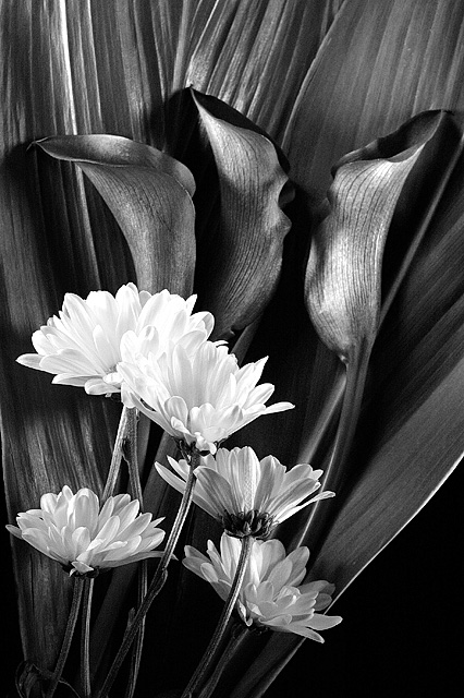
One of the absolute best high contrast images in this challenge. It is a super still life of amazing quality. |
|
 Photographer found comment helpful. Photographer found comment helpful. |
|
|
10/11/2006 04:42:12 PM |
What an amazing composition! This is stunning in black and white/high contrast!
|
|
| Photographer found comment helpful. |
|
|
10/11/2006 08:34:21 AM |
|
Boy, you're on a roll aren't you? :) Another beautiful B&W image Robert. |
|
| Photographer found comment helpful. |
Comments Made During the Challenge  |
|
|
10/10/2006 08:55:08 PM |
|
Looks like the color was just dropped out. The gray balance doesn't look natural. I've heard converting to Lab color in photo shop and droping the chroma channel would look better. Nice lines over all. |
|
| Photographer found comment helpful. |
|
|
10/10/2006 04:10:59 PM |
|
don't like the title too much, but I like the photo. nice use of contrasting color and textures. |
|
| Photographer found comment helpful. |
|
|
10/10/2006 02:59:59 PM |
|
very interesting textures |
|
| Photographer found comment helpful. |
|
|
10/09/2006 09:59:07 AM |
|
Gorgeous photograph! Great contrast! |
|
| Photographer found comment helpful. |
|
|
10/08/2006 10:04:40 PM |
|
Simply stunning with great definition and tonal gradation. 9 |
|
| Photographer found comment helpful. |
|
|
10/05/2006 07:02:03 PM |
|
I don't get the title, but I do like the photo :) |
|
| Photographer found comment helpful. |
|
|
10/05/2006 07:54:16 AM |
|
| Photographer found comment helpful. |
|
|
10/04/2006 08:19:47 PM |
|
Good composition, wonderful lighting. Maybe a little too much emphasis on large leaves in the background, otherwise good stuff. |
|
| Photographer found comment helpful. |
|
|
10/04/2006 03:40:55 PM |
|
Beautiful Floral shot. -- 8 |
|
| Photographer found comment helpful. |
Home -
Challenges -
Community -
League -
Photos -
Cameras -
Lenses -
Learn -
Help -
Terms of Use -
Privacy -
Top ^
DPChallenge, and website content and design, Copyright © 2001-2026 Challenging Technologies, LLC.
All digital photo copyrights belong to the photographers and may not be used without permission.
Current Server Time: 06/28/2026 05:32:04 AM EDT.