| Author | Thread |
|
|
10/25/2006 10:55:59 AM |
|
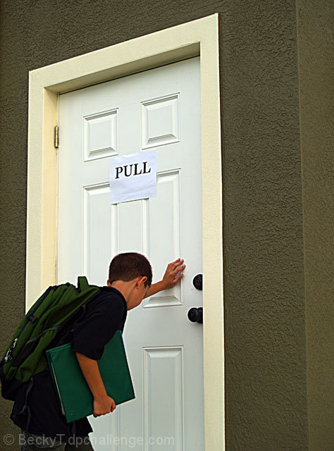
Heh. I gave this a 7. I know that cartoon well. In fact, I describe it trainings I give on Web design. :) |
|
 Photographer found comment helpful. Photographer found comment helpful. |
|
|
09/22/2006 10:06:16 AM |
|
Ooo! Top 50! :) Congrats! |
|
| Photographer found comment helpful. |
Comments Made During the Challenge  |
|
|
09/21/2006 04:58:24 PM |
|
| Photographer found comment helpful. |
|
|
09/20/2006 07:27:55 PM |
Returning for comments:
Neat reactment. |
|
| Photographer found comment helpful. |
|
|
09/18/2006 11:39:32 PM |
|
One of the most classic Far Side cartoons recreated. Poor kid! |
|
| Photographer found comment helpful. |
|
|
09/18/2006 09:37:50 AM |
|
I always loved this one. Nicely done! |
|
| Photographer found comment helpful. |
|
|
09/17/2006 09:44:39 PM |
|
Great take on the original! Clean with nice sharpness, composition and shades of green bringing this all together. |
|
| Photographer found comment helpful. |
|
|
09/16/2006 09:05:44 AM |
|
Hehe, one of my favorite far sides that I always think about when I get involved with those stupid doors! |
|
| Photographer found comment helpful. |
|
|
09/15/2006 08:45:26 PM |
|
The sign on the door kills it. The physical sign that is, I know that's the key to the joke. Perhaps if you had found a school or business door to use. |
|
| Photographer found comment helpful. |
|
|
09/15/2006 05:16:50 PM |
|
| Photographer found comment helpful. |
|
|
09/15/2006 11:48:51 AM |
|
:) I hoped I would see this one in the challenge! |
|
| Photographer found comment helpful. |
|
|
09/15/2006 11:42:02 AM |
|
I am disappointed with your "pull" sign..... simply a piece of paper stuck on, and in an unlikely position. With a bit more effort, this would have been much more impressive. |
|
| Photographer found comment helpful. |
|
|
09/15/2006 11:33:41 AM |
|
I wondered when someone was going to do this one! |
|
| Photographer found comment helpful. |
|
|
09/15/2006 09:35:11 AM |
|
I knew there had to be at least one!!! good detail. |
|
| Photographer found comment helpful. |
|
|
09/15/2006 04:40:26 AM |
|
simple and effective, crop IMO too tight |
|
| Photographer found comment helpful. |
|
|
09/15/2006 12:57:20 AM |
|
Needs to look more like a commercial building. |
|
| Photographer found comment helpful. |
|
|
09/15/2006 12:10:26 AM |
|
I think there is a bit too much space on the right and not enough on the left, but otherwise I like it. |
|
| Photographer found comment helpful. |
|
|
09/15/2006 12:03:37 AM |
|
| Photographer found comment helpful. |
Home -
Challenges -
Community -
League -
Photos -
Cameras -
Lenses -
Learn -
Help -
Terms of Use -
Privacy -
Top ^
DPChallenge, and website content and design, Copyright © 2001-2026 Challenging Technologies, LLC.
All digital photo copyrights belong to the photographers and may not be used without permission.
Current Server Time: 06/30/2026 06:46:53 PM EDT.