Hi there,
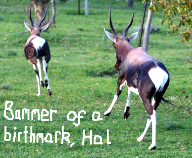
Firstly I'll suggest making it a squarer crop... pic'll look less cluttered. Also scrap the writing.. It's slightly distracting...You should probably take up the format..shown in the linky below.
Even with the white frame thing you could keep the wonky writing.. maybe you should find a font that's delibrately crazy.. you should experiment with the saturation as well.. the green's kind of overpowering..
Everything said and done :) It's still a tremendously fuuny pic and looking back at it still makes me laugh!
I think you could have done without the text on the actual image (or improved it with a not hand-drawn font) but this fits the challenge as well as being an interesting photo on its own.
not quite as half as good as the Larson verson for one you didn't need to muck it up with the poor type you could've left the rather famous caption just be your title and people would've gotten it for sure. and second the target is done in kind of a hack way and the animals are not in the best pose for the situation...if you remember the target was on the front of a deer and it was red and white...the 2 deer were standing still and the one was turned with jaw open to show he was the speaker. IMO this is a poor rendition of a very funny and classic Larson scetch. you were on the right track just isn't done the level of refinement that it should be. remeber every cartoon larson did was hours of work and thought...this doesn't exactly reflect the same quolity (in photo form) as his work did (in scetch).





 Add photograph to your favorites
 Add photographer to your favorites

 Photographer found comment helpful.


