| Author | Thread |
Comments Made During the Challenge  |
|
|
09/30/2003 06:23:13 PM |
|
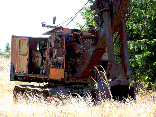
Nice idea for the challenge. The foreground and left side of the frame seem a bit "hot" though. |
|
|
|
09/29/2003 04:18:48 PM |
|
the darks are too dark and the lights are too light... in short too much contrast. |
|
|
|
09/29/2003 02:00:51 PM |
|
|
|
09/28/2003 01:25:50 PM |
|
the grasses in front are blown out. a better angle or closer POV might have helped alleviate that. try to avoid shooting into the direction of the sun. |
|
|
|
09/27/2003 07:06:49 PM |
|
|
|
09/25/2003 11:45:18 PM |
|
What a catch! Character that is second to none here! |
|
|
|
09/25/2003 04:48:11 PM |
|
|
|
09/25/2003 04:29:20 PM |
|
Good play on words in the title. Looks overexposed in areas. |
|
|
|
09/25/2003 03:14:56 PM |
|
He, he, funny! Looks a bit overexposed. I like the composition though. ~7 |
|
|
|
09/25/2003 11:15:25 AM |
|
nice idea for the challenge, a bit too overexposed on the left side |
|
|
|
09/25/2003 01:13:27 AM |
|
The lighting doesn't work here. Way too harsh and too much on the foreground and not enough on the subject. |
|
|
|
09/24/2003 09:31:44 PM |
|
Seems overexposed to me.... |
|
|
|
09/24/2003 06:33:25 PM |
|
|
|
09/24/2003 10:56:09 AM |
|
Good title. Interesting solarization or effects on this. Good capture. |
|
|
|
09/24/2003 03:26:03 AM |
|
Too much contrast. The upper left part of the image is too bright. |
|
Home -
Challenges -
Community -
League -
Photos -
Cameras -
Lenses -
Learn -
Help -
Terms of Use -
Privacy -
Top ^
DPChallenge, and website content and design, Copyright © 2001-2026 Challenging Technologies, LLC.
All digital photo copyrights belong to the photographers and may not be used without permission.
Current Server Time: 06/28/2026 10:13:33 PM EDT.