I think some of the comments you have already received have pointed out the things I see in this picture.
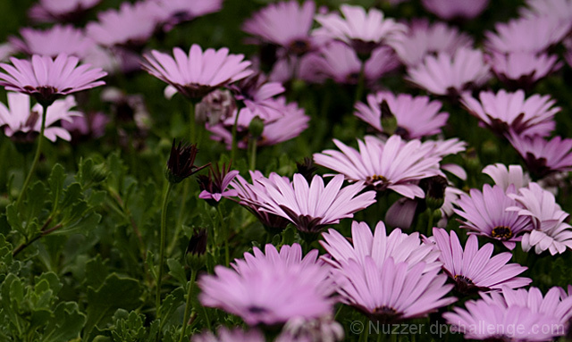
The large green area does compete. The softness of the foreground flowers push your eye to the green area. The green just comes on too strong. The brightness could go up a bit. The photo looks like it was taken on a dark cloudy day, or the camera under exposed the shot.
I do like the shallow depth of field in the back of the frame. It is detailed enough to tell us the flowers go on, maybe forever, yet push the eye back forward to the flowers in focus to keep the eye in the picture.
I might have trimmed of a couple of the buds, that stick up into the flower bloom area. There is one along the right third of the photo, right at the back of the sharp area that competes with the blooms.
Nice colours but I think your composition could be stronger. My eyes immediately go to the bare spot on the left and the out of focus flowers in the front. Perhaps a better crop would help this.






 Add photograph to your favorites
 Add photographer to your favorites

 Photographer found comment helpful.


