Critique Club Review:
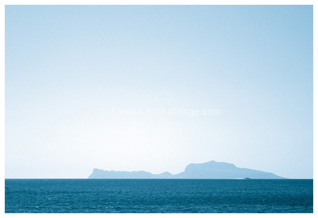
Nice color tones, comes out almost a monochromatice study in blue.
You received some nice comments, and no negative comments, so why didn't this picture score higher?
Lighting, color and contrast are all good. Though cooler colors (blues grays) sometimes get fewer votes than the warmer colors.
The passing boat is a little bit distracting. Not big enough for detail, not small enough to ignore. You have a lot of sky. While a pretty color it is empty, and overwhelming. Looking at this picture I wish for a larger island. The sea is bold and large, the sky is huge, and the island comes out small in comparison.
Still, this a nice enjoyable picture and I feel that you should have scored a little higher than you did. |






 Add photograph to your favorites
 Add photographer to your favorites

 Photographer found comment helpful.


