| Author | Thread |
|
|
11/09/2006 04:52:50 PM |
Originally posted by lynnmarie:
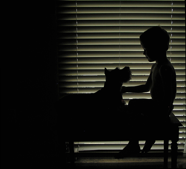
My choice to keep the negative space on the left... may have cost me some votes. |
Definitely! You captured a creat moment here with beautiful lighting, but the dark area pulls your eye away from the story IMO. Crop that out and this shot scores over 6.5 easy. |
|
 Photographer found comment helpful. Photographer found comment helpful. |
|
|
10/10/2006 12:07:54 AM |
|
This is a very nice silhoette study. The lighting imparts a personal feeling of attachment. Keep up the nice work. |
|
| Photographer found comment helpful. |
|
|
09/10/2006 12:42:07 AM |
|
love the slight bit of light giving a hint of detail to the face - this is really nicely observed lighting - nice work! |
|
| Photographer found comment helpful. |
|
|
09/09/2006 05:55:21 PM |
Back from vacation to see that you scored north of 6 for the first time. CONGRATULATIONS! I personally would have placed it a bit higher than 50th but you had some stiff competition on this one. The cool thing to me is that you captured an emotive shot...my favorite kind. At the rate you are improving your scores, you'll be crossing off that >7.0 goal before the month is out! Rock on!
*****Oh yeah...and I can't wait to see what the science teacher does for Chemistry.
Message edited by author 2006-09-09 17:57:32. |
|
| Photographer found comment helpful. |
|
|
09/06/2006 10:59:43 PM |
|
| Photographer found comment helpful. |
|
|
09/06/2006 12:46:30 PM |
In explaining my rating of 5 I go back to my argument that a photo strength comes from it's ability to communicate and entertain.
Most of the time I may vote lower because the photo just does not interst me. Even in technically well made photos.
Yours goes the other way. You made a good choice on your subject matter and it caught my attention. The trouble when I started to look at the photo was the black on the left, almost felt as if you were shooting past a doorway or something and caught the door or curtain in the photo. This ruined my ability to get into the photo, made it feel like a snapshot. If you would have been able to correct that part of the photo I could see me giving this photo a 7 easily. |
|
| Photographer found comment helpful. |
|
|
09/06/2006 10:40:50 AM |
|
| Photographer found comment helpful. |
|
|
09/06/2006 12:36:26 AM |
My choice to keep the negative space on the left proved to be most controversial for me in this challenge. 22 out of the 45 comments I received expressed their dislike, while many others said it looked good. I don't know, but I think it may have cost me some votes. :(
At any rate, I had a blast giving this a go! |
|
Comments Made During the Challenge  |
|
|
09/05/2006 11:53:36 PM |
|
Wow. Awesome lighting, and great overall feel. This should do VERY well. 9 |
|
| Photographer found comment helpful. |
|
|
09/05/2006 08:37:20 PM |
|
NICE USE OF NEGATIVE SPACE ON THE LEFT |
|
| Photographer found comment helpful. |
|
|
09/05/2006 07:15:15 PM |
|
Lovely image... am wondering why you did not crop the large dark on the left. |
|
| Photographer found comment helpful. |
|
|
09/05/2006 12:50:29 PM |
|
There are pictures... and then there are images that strike a chord with the audience, evoking fond memories, or generating a feeling of warmth and well being. This is one of those rare pearls, and justly warrants the 10 score I gave it. Very well done indeed. |
|
| Photographer found comment helpful. |
|
|
09/05/2006 11:19:22 AM |
|
cropping out the left would have made this image stronger in my opinion |
|
| Photographer found comment helpful. |
|
|
09/05/2006 12:36:22 AM |
|
Too much negative space on the right. This could easily be cropped to eliminate ALL of the black area on the right and make a GREAT image! |
|
| Photographer found comment helpful. |
|
|
09/04/2006 06:46:45 PM |
|
Has potential, however the doorframe or whatever it is on the left really takes your eyes away from the subject. I would personally have scored this image higher if it was cropped to remove the left margin. |
|
| Photographer found comment helpful. |
|
|
09/04/2006 12:01:35 PM |
|
The negative space to the left of the picture spoils it a bit for me. |
|
| Photographer found comment helpful. |
|
|
09/04/2006 11:34:41 AM |
|
Nice photograph. I might have reflected a little more light though on the dark side of the photograph. It is a little too heavy. I wonder what it would look like if you just cropped that part off? |
|
| Photographer found comment helpful. |
|
|
09/04/2006 10:15:13 AM |
|
I LOVE this - it's just too bad about the black on the left!! |
|
| Photographer found comment helpful. |
|
|
09/04/2006 12:43:23 AM |
|
The thing I like about this, is the stark contrast between the silhouetted and the background. Many photos in this particular competition have fuzzy edges that take away from the strong emotion silhouettes are supposed to evoke. Likewise, this photo seems less arbitrary and contrived than most in this competition. (I really don't care what a statue of a man with a banjo looks like juxtapositioned against a sunset) |
|
| Photographer found comment helpful. |
|
|
09/04/2006 12:39:04 AM |
|
I like how this shot is not a standard 2D silhouette like most of the other entries. The subjects stand out nicely against all the rectangular objects surrounding them. |
|
| Photographer found comment helpful. |
|
|
09/03/2006 06:35:34 PM |
I really like this image. Because of your unusual composition with the wall down the left of the image, it almost feels like your peeking into the room and catching a very touching moment between a little boy and his dog.
I think the thing I love most is the rim lighting around the face and chest of the lad. Lovely image, well done! |
|
| Photographer found comment helpful. |
|
|
09/03/2006 11:04:18 AM |
|
I like this one..... love the effect that you have achieved..... |
|
| Photographer found comment helpful. |
|
|
09/02/2006 05:53:59 PM |
|
Absolutely perfect picture... Love everything about it.. I think it is nice to see a littlebit of the boys sholder, it adds to the beauty of the picture.. also the dark left side off it... BEAUTIFUL |
|
| Photographer found comment helpful. |
|
|
09/02/2006 03:12:30 PM |
|
| Photographer found comment helpful. |
|
|
09/01/2006 04:14:51 PM |
|
| Photographer found comment helpful. |
|
|
08/31/2006 11:46:53 PM |
|
Nice capture. The shadow on the left side detracts and makes the shot seem out of balance to me. |
|
| Photographer found comment helpful. |
|
|
08/31/2006 11:27:44 PM |
|
Nice composition and mood |
|
| Photographer found comment helpful. |
|
|
08/31/2006 11:12:50 PM |
|
The shadow on the left is quite distracting from the image. I'm a bit on the fence about the blinds. The parallel lines lend something to the image, but compete with the subject. If you keep them in, you should reposition your subjects and zoom in to eliminate the cord-tracks that hold the blinds up, leaving only the parallel lines. |
|
| Photographer found comment helpful. |
|
|
08/31/2006 05:23:28 PM |
|
Love the lines of the blinds. The detail on the schnauzer's chin is great. Sweet. What if you cropped some of the black on the left.... it doesn't really add to the shot much. Still.... I like it - different. 7 |
|
| Photographer found comment helpful. |
|
|
08/31/2006 11:44:13 AM |
|
really do like the silhouettes of the boy and his dog, nice lighting here; but the band of darkness on the left of the image is distracting |
|
| Photographer found comment helpful. |
|
|
08/31/2006 10:02:12 AM |
|
I think the negative space on left could have been cropped IMHO |
|
| Photographer found comment helpful. |
|
|
08/31/2006 09:30:45 AM |
|
| Photographer found comment helpful. |
|
|
08/31/2006 07:27:42 AM |
|
not sure how I feel about the dark spot on the left of the frame. I dont think it possibly adds anything. however i love the rest of the photo. 8 |
|
| Photographer found comment helpful. |
|
|
08/31/2006 03:51:54 AM |
|
Even if I find to many details for a silhouette it could be a nice shot without the black stripe on the left |
|
| Photographer found comment helpful. |
|
|
08/30/2006 09:17:51 PM |
|
Beautiful emotive shot. Very strong. Excellent composition and I even like some of the darkness to the left...but perhaps trimming a bit of it out would have been stronger. Very nice. 8 |
|
| Photographer found comment helpful. |
|
|
08/30/2006 09:10:30 PM |
|
Adorable. Putting in my faves! |
|
| Photographer found comment helpful. |
|
|
08/30/2006 08:22:11 PM |
|
| Photographer found comment helpful. |
|
|
08/30/2006 08:02:27 PM |
|
| Photographer found comment helpful. |
|
|
08/30/2006 07:20:11 PM |
|
all the negative space on the right is a little distracting from the subject |
|
| Photographer found comment helpful. |
|
|
08/30/2006 07:05:45 PM |
|
I think a different crop of the dog and the boy would do wonders for this photo. |
|
| Photographer found comment helpful. |
|
|
08/30/2006 06:37:15 PM |
|
This is beautiful and charming. I just don't understand why you didn't crop away the large black area on the left. |
|
| Photographer found comment helpful. |
|
|
08/30/2006 04:41:28 PM |
|
This is really good if it weren't for all the black space on the left. |
|
| Photographer found comment helpful. |
|
|
08/30/2006 03:15:36 PM |
|
The right hand 2/3rds of this photo is great. The left hand third is a big black block that really hurts it. Shame. |
|
| Photographer found comment helpful. |
|
|
08/30/2006 02:29:15 PM |
|
Very cool setup with the blinds. I can see a real connection with the boy and his dog. Nicely done! |
|
| Photographer found comment helpful. |
|
|
08/30/2006 01:53:29 PM |
|
Nice and tender moment you have captured. I really dislike that half the photo is pure black though. I personally would have cropped in to focus on the subjects. |
|
| Photographer found comment helpful. |
|
|
08/30/2006 11:46:00 AM |
|
THIS IS SO NICE! GREAT JOB! |
|
| Photographer found comment helpful. |
|
|
08/30/2006 10:05:31 AM |
|
Great capture. loveley composition. The negative space on the left works well with the shot. Bumping up. |
|
| Photographer found comment helpful. |
|
|
08/30/2006 09:04:30 AM |
|
great shot but i'm not feeling the square crop, IMO, I would crop the bottom 1/4 of the image, just above his ankle 7 |
|
| Photographer found comment helpful. |
|
|
08/30/2006 08:24:10 AM |
|
ribbon winner??? I hope so for you...excellent and perfect for the challenge...great comp and lighting |
|
| Photographer found comment helpful. |
|
|
08/30/2006 05:12:11 AM |
|
the dark part a t left is very distracting, focus seems to be on the blinds, not on the boy and dog |
|
| Photographer found comment helpful. |
|
|
08/30/2006 03:05:34 AM |
|
Great shot, it's a shame about the left hand side, it spoils the affect a little. i would have preferred a tighter crop to just include the blinds or at least less of the shadow. |
|
| Photographer found comment helpful. |
|
|
08/30/2006 01:23:40 AM |
Schnuazer!!!
I like schnauzers... at least, I think it's a schnauzer. The completely black bar of the image does look good. The placement is good, I like it |
|
| Photographer found comment helpful. |
|
|
08/30/2006 12:33:36 AM |
|
What a lovely picture! Too bad you didn't crop out the black on the left side. You know what they say: "What doesn't add to a picture should be removed". I still give it a 9. |
|
| Photographer found comment helpful. |