| Author | Thread |
Comments Made During the Challenge  |
|
|
08/04/2002 04:24:00 PM |
|
 Photographer found comment helpful. Photographer found comment helpful. |
|
|
08/03/2002 01:18:00 AM |
|
| Photographer found comment helpful. |
|
|
08/02/2002 05:02:00 PM |
|
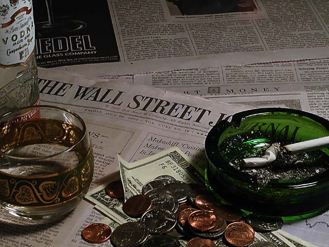
I think the vodka bottle needs to be a little more to the right, just for balance. other wise good shot, and neat idea. karmat |
|
| Photographer found comment helpful. |
|
|
08/01/2002 08:48:00 PM |
Better lighting would have kicked this up a point in my mind
|
|
| Photographer found comment helpful. |
|
|
08/01/2002 06:22:00 AM |
|
I like the idea, I like the overall atmosphere created here, but the composition seems to lack a central element. This might seem a little pedantic, but the ashtray (in my opinion) should have been the central theme and not the words on the newspaper. My main suggestion would be to have treated the newspaper like wallpaper. Everybody knows Wall Street and the journal, so only seeing part of the words would not have detracted from the image theme. Having said that, technically, it's fine and I really like the lighting. Good luck… |
|
| Photographer found comment helpful. |
|
|
07/31/2002 11:13:00 AM |
|
yea and that vodka will destroy your stomach lining! |
|
| Photographer found comment helpful. |
|
|
07/31/2002 10:02:00 AM |
|
A bit unfosused... a little distracting |
|
| Photographer found comment helpful. |
|
|
07/31/2002 06:00:00 AM |
|
| Photographer found comment helpful. |
|
|
07/31/2002 02:44:00 AM |
|
| Photographer found comment helpful. |
|
|
07/30/2002 11:39:00 PM |
Composition - very good
Technical Aspects - very good
Meets Challenge - yes
Visual Impact / Originality - good
|
|
| Photographer found comment helpful. |
|
|
07/30/2002 09:58:00 PM |
|
I like it. Definitely a realistic situation.. I would have added the handgun in though :)~ |
|
| Photographer found comment helpful. |
|
|
07/30/2002 06:29:00 PM |
|
This is by far the best of the newspaper photographs this week, if only because you got the lighting just right. Definite tension in this. |
|
| Photographer found comment helpful. |
|
|
07/30/2002 05:49:00 PM |
|
I really like the low lighting for this picture |
|
| Photographer found comment helpful. |
|
|
07/30/2002 01:33:00 PM |
|
Good composition, except there isn't much going on in the upper half of the picture, where the bottom half is very busy. |
|
| Photographer found comment helpful. |
|
|
07/30/2002 11:16:00 AM |
|
interesting image... I can't really see much room for improvement on this one. I wonder what it would look like if the papers under and behind the 'wall street journal' were removed from the image to show a wooden table top? ... just a thought.. The glass is a nice touch. I think it would work nicely with a completely clear glass filled with ice and a brown whiskey in this image :) good work.. - jmsetzler |
|
| Photographer found comment helpful. |
|
|
07/30/2002 01:41:00 AM |
|
seems a little dark, however, when I turn the brighness to 100% on my monitor it is fine ......... |
|
| Photographer found comment helpful. |
|
|
07/29/2002 06:02:00 PM |
|
a bit on the dark side. some fill flash or extra lighting would've made this shot. |
|
| Photographer found comment helpful. |
|
|
07/29/2002 04:34:00 PM |
|
Excellent in every way - one of my top 2 for this challenge, - good luck |
|
| Photographer found comment helpful. |
|
|
07/29/2002 02:30:00 PM |
|
Pretty nice. possible improvements...a little more light...maybe the glass tipped over with vodka dribbling out to indicate you stumbled away in disgust...a few more butts. I get the all your money's on the market thing and I love the play of lights on the loose change...but that also shows that you have some cash. so, maybe the money could have stayed out. 7 Lisa |
|
| Photographer found comment helpful. |
|
|
07/29/2002 02:09:00 PM |
|
| Photographer found comment helpful. |
|
|
07/29/2002 12:57:00 PM |
|
By George, I think (s)he's got it. A hair lighter gets you a 10, but a 9 is nothing to sneeze at. |
|
| Photographer found comment helpful. |
|
|
07/29/2002 12:53:00 PM |
|
This is really good. I like the dull lighting a lot, and the contrast between the coins, n ashtray against the newspapers is very good. |
|
| Photographer found comment helpful. |
|
|
07/29/2002 12:08:00 PM |
|
composition good and good theme....a little dark though |
|
| Photographer found comment helpful. |
|
|
07/29/2002 01:48:00 AM |
|
I think this about sums it up:) Nice job.= 8 Shiiizzzam |
|
| Photographer found comment helpful. |
|
|
07/29/2002 01:43:00 AM |
|
You are effective in getting your message across here but you are not doing it in a particularly beautiful way. Don't care for the composition, particularly the top two pages of the WSJ and all that change. The change is in the foreground and too dark and out of focus. With fewer objects and a better arrangement of them you would have had a much better picture. Good idea though. |
|
| Photographer found comment helpful. |
|
|
07/29/2002 12:13:00 AM |
|
Is the money supposed to represent the only bit that's left? |
|
| Photographer found comment helpful. |
Home -
Challenges -
Community -
League -
Photos -
Cameras -
Lenses -
Learn -
Help -
Terms of Use -
Privacy -
Top ^
DPChallenge, and website content and design, Copyright © 2001-2026 Challenging Technologies, LLC.
All digital photo copyrights belong to the photographers and may not be used without permission.
Current Server Time: 06/28/2026 02:37:46 PM EDT.