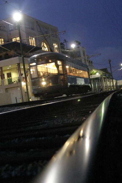
Focus: The building is sharp, so I gather the train is moving, as it appears to be a bit soft. You need a little more motion blur to make it clear the train is moving, to the viewer. Decent overall exposure. Had it been any more, the lights would have overpowered the piece.
The angle at which you took the picture is interesting, but in this case it makes it look like the building is falling over backwards.
Color, saturation, and hue are all done well.
I do applaud your taking the picture from the level of the tracks. Very good point of view, and works well here. Too many cameras never leave the photgrapher's eye level. Nice job.
With some noise reduction in the sky and the full 720 pixels used, I think this would have presented itself much better overall. Good angle/perspective on this.
Technical: The lighting is good, the contrast is good, i think if you would have gotten even more blur with the train, or a nice crisp shot, it would have been even better...the composition is what sets this image aside from others!
Creativity: very good idea!
Score: 7
Whilst using movement blur in an image might give the image some dynamic impact, I don't think it does in this case. The movement is too small and the tilted view does not add to the scene. It is also rather noisy (in the sky), which draws attention. Perhaps it would have worked better without the rather distracting background?
an interesting perspective and i really like the idea here... however, it could have been executed better. to make this a really strong shot you would probably need a tripod, or something like it to avoid camera shake. then, it would be really neat to use your manual settings and have the shutter stay open for a couple of seconds to get the effect of long exposure. just some ideas :) 5







 Add photograph to your favorites
 Add photographer to your favorites


