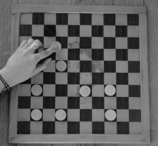
tried with long exposure to make it look like the hand moves the draught, but that didn't work, probably due to lack of experience. Now I don't think everyone sees the stupidness of that draughtmove...
Used black and white because of an awful stain on the draughtbord(which you still see)
Statistics
Place: 83 out of 99 Avg (all users): 4.4639 Avg (commenters): 5.2308 Avg (participants): 3.7750 Avg (non-participants): 4.5627 Views since voting: 859 Views during voting: 567 Votes: 319 Comments: 13 Favorites: 0
It seems a little soft to me. A shade more contrast and a touch more sharpening. I’m not sure where the sharpness went – is it a focus issue or lost in post-prossesing?
I see! It took a while but know I what is so stupid in here. Cool idea, but unfortunately the shot is a bit blury. The fingers are pretty and fit well.
Sorry but I don't see the Stupid, Stupid part of this image. The closest I can come to for Stupidity is that the black still thinks they have a chance to win even though there is only one black piece remaining. This image also suffers from poor contrast. The whites need to be whiter and the blacks blacker. I suggest you read the B&W conversion tutorial written by photomann under the Learn/Tutorial menu.
Edit: Now I see the Stupid, Stupid part, as the black piece will actually win. Guess I was too stupid to catch it.
Overall the tones in this shot are really flat. I think a bump up in brightness / contrast would help this out a ton. I do like that you've made the viewer stop and think about what it is I'm looking at and you've setup the board perfectly. Few tweaks and I think you'll have something.






 Add photograph to your favorites
 Add photographer to your favorites


 Photographer found comment helpful.


