| Author | Thread |
|
|
08/28/2006 08:43:51 AM |
Greetings from the Critique Club -
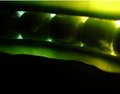
Well - looking at your description it seems like you have a general understanding where this shot is lacking. The lighting is weak and the colors are flat. The orange tint to the picture overall is unflattering. I think a tweak in levels or curves could have brought out the brightness and natural colors of your subjects.
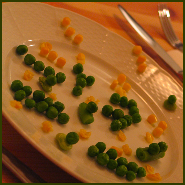
A nice setup. It does have a feel of a battle between the corn and peas. You definitely met the challenge with this pic. For me the angle of the plate is a bit extreme - it almost makes me a bit dizzy.
The border is an odd color and doesnt suit the image IMO. I am assuming you pulled the color off of one of the peas but I think a thin black border would have suited this better.
Looking down now at earlier comments it seems like you recieved great feedback which is sometimes hard to come by and the lower and mid range shots. Keep working at it and trying out different stuff and you will be breaking out of the 4s and 5s in no time. GOod luck in future challenges.
Tim |
|
Comments Made During the Challenge  |
|
|
08/20/2006 05:20:00 PM |
|
I wish there was the photo was a little more exposed. Colors also look a little off. |
|
|
|
08/19/2006 07:54:31 PM |
|
I like the angle and the layout. Your color is a bit warm. |
|
|
|
08/19/2006 01:55:15 PM |
|
|
|
08/18/2006 04:10:53 PM |
|
i'd like this image better if it had less of an orange tinge in the lighting. It washes out the other colors. |
|
|
|
08/16/2006 01:55:25 PM |
|
Little bit flat needs more contrast. |
|
|
|
08/16/2006 11:03:32 AM |
|
I like the overall idea but it is not pulled off well IMO. the tilt is not working for me here. Lighting could be much better which could have led to a sharper image. the silverware is not adding much for me and i would have cropped it out. extra point for the idea though. |
|
|
|
08/15/2006 07:27:44 PM |
|
I think this is a battle between the peas and the corn. Nice try, but ... huh? |
|
|
|
08/15/2006 05:44:10 PM |
|
|
|
08/15/2006 04:46:00 PM |
|
|
|
08/15/2006 03:55:41 PM |
|
Your white balance needs attention. The plate should be white? Some additional contrast would help. Also having a hard time connecting your image to the title used. Sorry. Good luck. |
|
|
|
08/15/2006 03:40:26 PM |
|
Clever idea, I would take some of the orange cast out and maybe level the plate some, the peas look like they are hanging there and should have already rolled off the plate... |
|
|
|
08/15/2006 12:23:29 PM |
|
It is easy to see that you took some time to plan your entry and I think your idea is very creative. Unfortunately, your image has a couple of technical shortcomings that are going to hurt your score considerably. The primary issue is that the image lacks saturation and looks a little dark. A little adjustment with levels or curves would help the plate look whiter and give the vegetables more pop. After levels/curves, I would suggest boosting the saturation to bring out the colors. The perspective you used to shoot this photo looks intentional but it really doesn't make sense to me. I can't help thinking that at that angle, the peas should be rolling off the plate. I guess I've been an engineer too long. |
|
|
|
08/15/2006 05:57:49 AM |
|
Contrast is a little soft, it's a little dark and my neck is a little stiff... but what a great battle. Just needs a few drops of ketchup to heighten the drama. |
|
|
|
08/15/2006 03:29:45 AM |
|
too dark, white balance is way off, tilt is too much, frame doesn't really fit |
|
Home -
Challenges -
Community -
League -
Photos -
Cameras -
Lenses -
Learn -
Help -
Terms of Use -
Privacy -
Top ^
DPChallenge, and website content and design, Copyright © 2001-2026 Challenging Technologies, LLC.
All digital photo copyrights belong to the photographers and may not be used without permission.
Current Server Time: 07/01/2026 10:40:14 AM EDT.