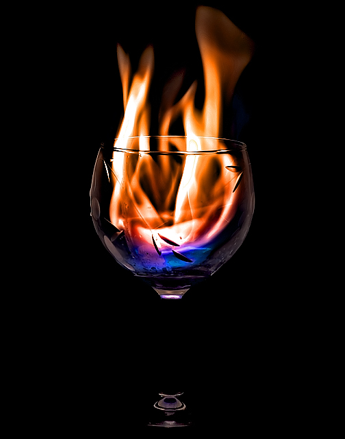
I didn't vote on this challenge so this is the first time I've looked at your image critically. As shown by your score, you executed your idea pretty well. As shown by the comments, there are a couple of things that could have been done differently to achieve a higher score, mostly the lighting at the stem and base of the wine glass. I really don't have any suggestions on how to better light this image but it would be fun to play around and see what could be done.
I also noticed that the pattern etched into the glass was a love it or hate it proposition. My guess is that your score would not have suffered if it was not there but did just a bit because it was. My own personal opinion is that the etching is a distraction and interferes with the impact of the flame.
The quality of this image would have rated a 6 or 7 in my book, depending how it compared with the other entries. I like this image and I would be proud to have it in my portfolio if I were you.
Beautiful. I love the fact that you chose a textured glass. For me, it adds a little more interest and sets it apart from similar shots. I wish there had been more light at the base, but since I can relate to the difficulties with these shots, I'm not about to vote you down for it. - 10
Interesting color in the flame, and the etched design adds an interesting refractive detail, but I'm missing the stem of the glass. It feels unbalanced somehow without it.
On the money. Sharp as a tack, Very Cool to Look At! I don't like the etched glass but that means nothing as far as the composition goes. Great Work! 9
this is good, but a couple of seggestions...the pattern in the glass distracts, and the base of the glass is cropped out...that's what I would suggest would lift this because the colours and crispness are there





 Add photograph to your favorites
 Add photographer to your favorites

 Photographer found comment helpful.


