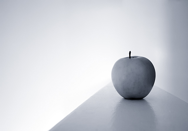
You've achieved fantastic tones in this image. Also, there's beautiful simplicity without being boring. I'm glad there's a little shininess on the table to contrast and offset the flatness of the apple. Sweet.
I like the bluish grays you've used here. While the shot is simplisitic, I don't actually feel it really nails the challenge. The apple is positioned in such a way that it appears to be tipped to the left which detracts from a sense of balance. Shot would benefit from some increased contrast. A different angle on the ledge might help here as well. This isn't a bad shot, but it just doesn't pull me in. 5.
I like the look you've achieved here. Especially the fade out to white. Not sure about how it fits with Zen. Guess it does. ;^) Anyway, I'm going to have to try something like this. It's nice. Good luck.
great as a b and w because it really reduces everything to a minimalism that suits the challenge (not that I really know what Zen is anyway...I am just guessing!) love the composition





 Add photograph to your favorites
 Add photographer to your favorites

 Photographer found comment helpful.


