Germaine,
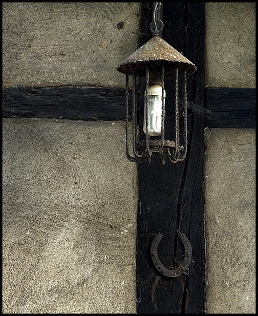
actually you're right - it is a different picture :). I mean, literally - it is a different shot. I just thought it would fit better for this crop.
Thanks again for your comments.
Hmmm. This has become a completely different picture. The impression I have in my mind of the first shot is a strong vertical line crossed by two strong horizontal lines. IMNSHO, the lantern was an interesting element, but not as important, visually, as the beams. Now, the picture is more about textures and tones and the lantern. The vertical and horizontal lines of the beams are part of the background.
I think that, visually, the first picture was/is a stronger graphic, but I don't think it comes across as well on a computer monitor which is a horizontal layout.
I'd like to see this on a wall. IMNSHO it's too long for monitors. I had to scroll a lot to see the whole thing. Actually, if you don't mind my saying, I think it's fine cropped just below the horseshoe. Great graphic. The horizontal and vertical lines are very powerful.







 Add photograph to your favorites
 Add photographer to your favorites


 Photographer found comment helpful.


