| Author | Thread |
Comments Made During the Challenge  |
|
|
07/31/2006 12:48:14 PM |
|
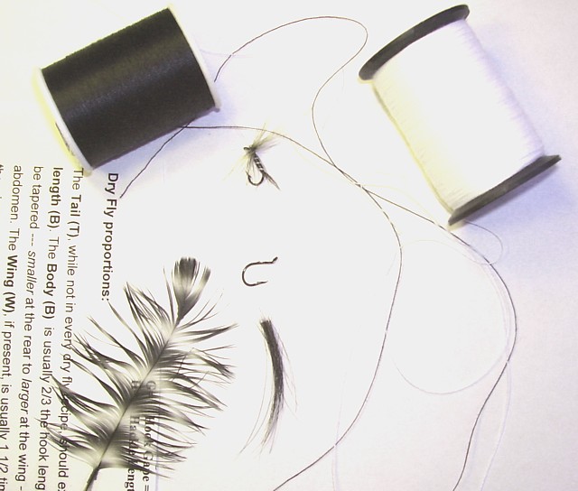
White balance is way off. |
|
 Photographer found comment helpful. Photographer found comment helpful. |
|
|
07/31/2006 10:29:28 AM |
|
Nice idea but too bright, guess exposure it a bit more... |
|
| Photographer found comment helpful. |
|
|
07/31/2006 10:12:07 AM |
|
Text book stuff and random positioning works. The slightly askew writing may have worked better with more skewing - just looks out of alignment as is. |
|
| Photographer found comment helpful. |
|
|
07/31/2006 05:46:02 AM |
|
| Photographer found comment helpful. |
|
|
07/30/2006 09:33:01 PM |
I love this.....everything about it.
And it tells a story to boot.
Well done! |
|
| Photographer found comment helpful. |
|
|
07/29/2006 08:51:25 PM |
|
A little overexposed. I assume you intended that, but it doesn't strike me as being as interesting as if I could see detail on the thread. |
|
| Photographer found comment helpful. |
|
|
07/29/2006 09:33:56 AM |
|
could be sharper, but I like the composition and the idea. |
|
| Photographer found comment helpful. |
|
|
07/27/2006 04:24:13 PM |
|
Nice title. This is a cool idea, but the technicals seem to be lacking a bit. The white spool is quite blown out, but it could really still use some contrast. Seems a bit overexposed. |
|
| Photographer found comment helpful. |
|
|
07/27/2006 04:11:32 PM |
|
I think this could hvae been better had it been rotated 90 degrees CCW. It forces you to try and turn your head to the side. Also more contrast would have worked. |
|
| Photographer found comment helpful. |
|
|
07/27/2006 02:28:09 PM |
|
| Photographer found comment helpful. |
|
|
07/26/2006 08:24:36 PM |
|
This has good potential. But the text limits the effect greatly. Fair enough, play with the viewer and tilt the text - but overtilting it simply takes away the focus on the items of interest and creates a disharmonic effect. Close up to remove so much diluting background would have been better too. 6. |
|
| Photographer found comment helpful. |
|
|
07/26/2006 10:55:15 AM |
|
If you adjust levels, you could really make the black POP. As it is, it's a bit faded out. |
|
| Photographer found comment helpful. |
|
|
07/26/2006 06:59:04 AM |
|
needs a little more contrast. |
|
| Photographer found comment helpful. |
Home -
Challenges -
Community -
League -
Photos -
Cameras -
Lenses -
Learn -
Help -
Terms of Use -
Privacy -
Top ^
DPChallenge, and website content and design, Copyright © 2001-2026 Challenging Technologies, LLC.
All digital photo copyrights belong to the photographers and may not be used without permission.
Current Server Time: 07/01/2026 10:50:43 AM EDT.