| Author | Thread |
Comments Made During the Challenge  |
|
|
09/16/2003 11:44:21 PM |
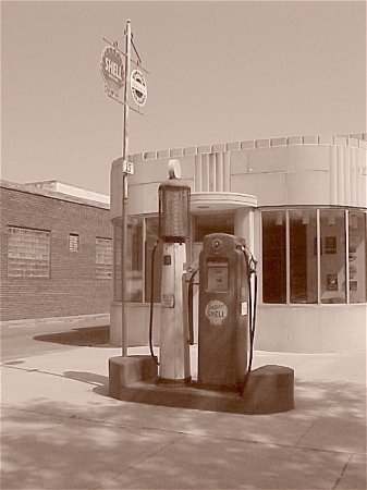
Beautiful shot. I wish that it had more depth of field. The pump blends in with the building in the background. More contrast may help. The angle of the shot gives it a lot of interest. Nice potential for really great shadows to make the subject pop out of the picture.
A little tweaking would definitely make this a great postcard or greeting card. |
|
|
|
09/15/2003 11:45:59 PM |
|
Nice idea, nice title. I'd love to go back to the day before a buck was only a half gallon! :-) Good choice for this challenge... |
|
|
|
09/13/2003 08:51:33 PM |
|
|
|
09/12/2003 04:43:53 AM |
|
|
|
09/11/2003 04:11:27 PM |
|
This is a great shot, certainly nostalgic. Taking your focal point off-center a little bit might have added a even more interest to the photo. Nice sepia and I like the fact that there are no clouds in the sky to detract from the pumps. Nicely done. |
|
 Photographer found comment helpful. Photographer found comment helpful. |
|
|
09/11/2003 12:27:59 AM |
|
Excellent, composition, subject and use of sepia makes it so authentic looking. |
|
| Photographer found comment helpful. |
|
|
09/10/2003 10:42:14 PM |
|
Nice photo, personally I would have cropped a little bit more of the concrete away, I like the sepia tones also. |
|
| Photographer found comment helpful. |
|
|
09/10/2003 01:52:13 PM |
|
Would have liked it better in color, but title makes the picture stand out. |
|
| Photographer found comment helpful. |
|
|
09/10/2003 11:25:00 AM |
|
Good idea for the challenge. I think the shot would be even better if the subject (gas pumps) were mooved to either of the side thirds of the frame. |
|
| Photographer found comment helpful. |
|
|
09/10/2003 01:51:39 AM |
Very well composed, nice content.
The photograph is lacking in contrast. |
|
| Photographer found comment helpful. |
|
|
09/10/2003 01:46:10 AM |
|
Really meets the challenge well. I think if you'd moved a bit to the right and made the sign more visible it would have been a better shot. |
|
| Photographer found comment helpful. |
|
|
09/10/2003 12:34:30 AM |
|
nice shot. like the shadows... |
|
| Photographer found comment helpful. |
Home -
Challenges -
Community -
League -
Photos -
Cameras -
Lenses -
Learn -
Help -
Terms of Use -
Privacy -
Top ^
DPChallenge, and website content and design, Copyright © 2001-2026 Challenging Technologies, LLC.
All digital photo copyrights belong to the photographers and may not be used without permission.
Current Server Time: 06/28/2026 11:23:37 PM EDT.