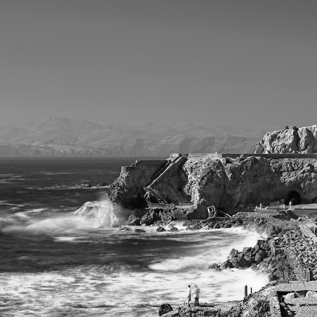
Shot with Hoya R72 infrared filter, ND filter to slow down the exposure. Wanted to give the sense of the crashing waves. Pretty harsh lighting so I decided to go IR. Seems to bring out details a little more, especially with an added ND filter and a F11 exposure.
Wished that there were clouds in the sky to bring out the skies and to even out the composition. The whole week it was either too foggy or really hot with no clouds. Really nothing in between :(
Originally, forgot that it was basic challenge so I dodged and burned the dark water to really bring out the waves. I also used a different crop but changed it because I couldn't burn some overexposed highlights from the shot.
Statistics
Place: 13 out of 326 Avg (all users): 6.6733 Avg (commenters): 7.6000 Avg (participants): 6.3235 Avg (non-participants): 6.8507 Views since voting: 2109 Views during voting: 401 Votes: 303 Comments: 28 Favorites: 2 (view)
I think your sky gives a feeling of being flatter than the image really is. The other thing that happens with the sky is the horizontal split dividing the picture in half. That "Rule of 1/3s" is not used here. On DPC, using a 1/2 split instead of a 1/3 compostion can make the difference in several tenths of a point.
So, in answer to your question of, "How could I have gotten a higher score?" you might have garnered a few tenths with a crop taking "a bit off the top."
Great job! A beautiful and interesting black and white photo. Nice movement and mood in the water, and the mountains on the distant shore are gorgeous. A couple of problems though. First, in the foreground is a couple One seems to be fairly in focus, and the other is blurred. I think this is a result of a mistake with post-processing. And secondly a water shot, or even a shoreline shot, does not always mean 'beach' in my opinion. And meeting the challenge, to me, is the first and most important thing, if that isn't done, then anything else is unimportant. Doesn't mean it's not a beautiful and creative shot, because in this case, it absolutely is! I do love it! I went back and forth on how to score your pic, but I do vote low for those that I don't think meet the challenge, so to be consistant, I am voting this lower than I want for the reasons stated above.
I like the contrast you used in converting this image to B&W. My only suggestion would be to crop some of the sky, as it has no detail and is not effective use of negative space.
Very nice contrasts in this photo. Seems like a bit to much sky compositionally seems to really divide and pull the eye away from the great contrast and details in the lower half.
I don't think people who don't know about the baths would find this very interesting. A little less vertical and more horizontal would probably work better. I like the depth and sharpness though. Did you try it after the fog fully came in?






 Add photograph to your favorites
 Add photographer to your favorites

 Photographer found comment helpful.


