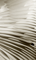
I had this idea since the challenge announced. Actually I thought the light will pass through the cabbage and may give cool effects. But light do not pass thought the cabbage. So here it is.
PP:
Levels
Curves
Brightness and contrast
NI
USM
Crop
Image resize
USM
USM
Border
Save for web
Statistics
Place: 76 out of 199 Avg (all users): 5.7104 Avg (commenters): 6.9091 Avg (participants): 5.5610 Avg (non-participants): 5.7986 Views since voting: 1214 Views during voting: 336 Votes: 221 Comments: 12 Favorites: 0
I found this after the challenge was over and I really liked the idea. And I think I understand where you were going with the post processing, if I'm wrong, shot me ;)
First of all it does feel abstract to me which means a lot because I don't normally understand or get abstract pictures but this feels like it has a pattern yet you have to really study it to find it. And I personally like the muted colors, gives more the feel of some of the great abstract artists and pictures I've seen (don't ask me to name names, I was told there were abstract) and makes it feel and look a bit older than it really is.
But as you well know the DPC Voter doesn't always understand art or what we are trying to convey with our picture and you paid for that with this shot. If you and brightened the colored just a touch, brought up the contrast and sharpened it just a bit more this probably would have easily been over a 6.
I hope my comments help and Good Luck in future Challenges!
Back to comment - I like this shot (and wish I had thought of cabbage myself). I think I would have liked to have seen better color though. A littl ebrighter overall, whiter whites and a more saturated purple to make it just stand out strong. Great idea though - I hope it does well for you.
i think the vegtable should have been more parrellel / you have lost focus & tried to sharpen to compensate .. nice abstract - i like the spiral aspect
Abstract as I perceive abstract? Yes
Do I like it? It's a bit too centered for my taste, I think.
Technicals? A bit weak - I'd expect the focus to be very sharp for a flat cut like this, and the contrast is a bit flat to me.







 Add photograph to your favorites
 Add photographer to your favorites

 Photographer found comment helpful.


