a rush job to get an entry in, thats why ISO is 800 :(
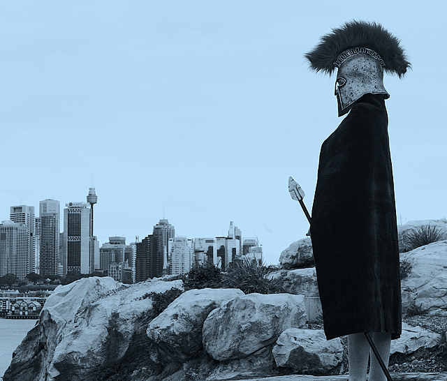
raw adjustments in rawshooter pro:
change to B&W, add blue hue, boost contrast
adjustments in PS2:
contrast, darken, sharpen, resize, light sharpen.
save for web
Statistics
Place: 20 out of 152 Avg (all users): 6.1144 Avg (commenters): 6.9375 Avg (participants): 6.0806 Avg (non-participants): 6.1244 Views since voting: 911 Views during voting: 406 Votes: 271 Comments: 35 Favorites: 2 (view)
this is funny to me simply because it looks like something I would do :) ... I like the idea a great deal. I think it needs something - like more of a view of the face. I'm not really a big fan of the color just because it has eliminated white and that high tonal range. I would suggest using a desaturation effect with on an RGB image and use "colorize" which will give you a more complete tonal range. Hopefully this makes sense and hopefully you use photoshop because that's what I'm talking about. I did locate a movie link to illustrate a good way to do this:
//www.photoshopsupport.com/tutorials/tt/adjustment-layer-mov.html
Brilliant set-up. Very strong composition. I'd like to see the colour version - I wonder if the blue hue is a bit unnecassary. Still, one of my favourites of the challenge. And a clever pun in the title.
Not really fond of the blue duotone here, I think I would have liked this shot better in just plain b/w or in low sat, strong contrast color. Nice idea though and well executed.
the first pic of the challenge that made me sit up. A very good shot and if you have time you should setup very mild sun rise colours at the horizon between the rocks and the buildings. Not only will that put a healthy balance of colours but also add to to the whole progress thing since sunrises represent new beginnings and stuff. A very cool shot.
This is a very cool photo, I really like it. I think it would have been better though if you would have had the character show a little more emotion. Maybe portray confusion or sorrow or even anger. As is it's just kind of boring. But overall excellent!
Wow, this is really surreal!!! Not sure why you chose the blue tone, not even sure I like it but I love the rest of the photo so I guess it doesn't matter too much. Did you try a sepia tone?
The color tone of this image are very interesting and work very nicely imho. The costume looks a bit fake and cropping at the ankles hurts the composition of the photo.





 Add photograph to your favorites
 Add photographer to your favorites

 Photographer found comment helpful.


