| Author | Thread |
|
|
07/17/2006 08:03:00 AM |
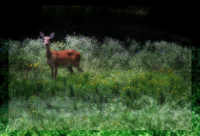
What an interesting way to arrange a picture.
I'm a little thrown off by the washed out nature of the deer, it really flattens the image a lot, but I like the rest of it... Would it be possible to bring the deer out just a bit by gently nudging the saturation and contrast just of the deer a bit? Especially in the face area... looks very smudgy...
It looks to my eye like you actually shrank the image by around 5-7% and pasted on top... there seems to be some repetition in the border...
I'm feeling a bit mixed on this, but personally, I'd kinda prefer the border be a mask to the effect rather than a carbon copy of the inner edge...
I've been paying a lot more attention to borders lately and this is one of the more interesting ones I've seen lately.
I tried a bump of around +20 to reds saturation and +11 to yellow saturation and it wasn't too bad, but I still wasn't happy with the face of the deer... I wonder if a bit of masking might help the face?
I'll give it a twiddle in a few...
EDIT: How's this?

Message edited by author 2006-07-17 08:11:01. |
|
|
|
07/09/2006 12:41:30 AM |
|
Nice editing work! Love the composition and colors. I even like that border - very cool. |
|
 Photographer found comment helpful. Photographer found comment helpful. |
|
|
07/07/2006 10:42:17 PM |
|
| Photographer found comment helpful. |
Home -
Challenges -
Community -
League -
Photos -
Cameras -
Lenses -
Learn -
Help -
Terms of Use -
Privacy -
Top ^
DPChallenge, and website content and design, Copyright © 2001-2026 Challenging Technologies, LLC.
All digital photo copyrights belong to the photographers and may not be used without permission.
Current Server Time: 07/17/2026 03:45:41 AM EDT.