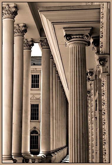
Rule of thirds, lead lines, grouping in 3s, and a traditional duotone. This is a busy shot, but it has a lot of the designer elements in a repetitious image. Im curious how well this will do. I like it.
Statistics
Place: 30 out of 140 Avg (all users): 6.1620 Avg (commenters): 7.5000 Avg (participants): 6.2651 Avg (non-participants): 6.0169 Views since voting: 1132 Votes: 142 Comments: 14 Favorites: 6 (view)
has interesting elements, but I don't know that you've arranged them at their best. Seems jumbled and many different elements competiting for attention
GRR, i hate that, I commented on this and then it did nto show up. Oh well try 2- I love the tones and details and I like that you got those 3 windows in between the columns too. Lovely shot.
I struggled with this image, coming back to it several times...the angle in the upper right is jarring to me and at first I found it a distraction but I do keep coming back to it and I guess that my feeling is that it adds interest to an image filled with repetition in line, texture and shape
I would love tho have seen a black border on this. The tones are very interesting and a black border, in my opinion, would have accentuated the tones better than the current border. Nice shot. One of my top pics.






 Add photograph to your favorites
 Add photographer to your favorites


 Photographer found comment helpful.


