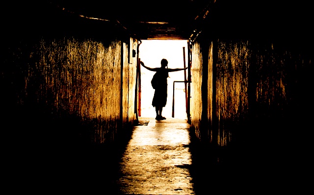
this probably would have been a 6 in a different challenge. People were hunting for objects (like people) that they considered 'not stationary.' That's were your 1s and 2s came from. Without those, you probably would have been over. As for the picture itself, I disagree with the lone commenter wanting more detail - I think its great just the way it is. A little too centered for my tastes but the image is really well taken. The color tones work very nicely together; the lights are dispersed well enough through the blacks to keep the image balanced. Excellent job!
This is exellent work. The light on the walls adds a cool dimension to the pic and the silhouette is nice. I'm surprised you didn't get your first 6+ on this one. 40 out of 282 ain't too shabby!
Contrast is a tricky beast.
Too little is a flat photo.
Enough is enough.
Too much is lost detail.
Somehow, one feels that detail was needed in this shot.
Could be a monitor calibration problem methinks...






 Add photograph to your favorites
 Add photographer to your favorites

 Photographer found comment helpful.


