| Author | Thread |
|
|
07/03/2006 12:22:26 AM |
|
Much better this time...more appealing to look at. |
|
 Photographer found comment helpful. Photographer found comment helpful. |
|
|
07/02/2006 10:58:30 PM |
|
Much better. The red was too overpowering. Now it is more natural. |
|
| Photographer found comment helpful. |
|
|
07/02/2006 02:40:26 PM |
|
I agree about the border. I made it smaller now. |
|
|
|
07/02/2006 02:34:15 PM |
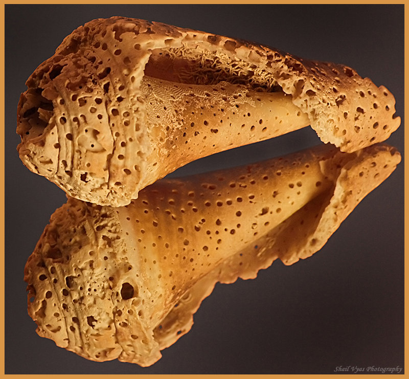
I agree. The red was strong enough that the shells almost seemed to sink into it, if that makes any sense? Now they rise above the darker, inviting me to look more closely.
The border matches well, but it seems to crowd the shells so that when my eye gets to the end of the shell it's grabbed by the border and taken off that direction. A very narrow one would be nicer, IMO.
The shells are gorgeous, btw, and the lighting really exposes all the fine detail well. :) |
|
| Photographer found comment helpful. |
|
|
07/02/2006 01:54:32 PM |
I prefer this one because there is more contrast between subject and color. I hate the border. If you MUST have one, make it much smaller.
Edited after the border was changed: much much better :-)
Message edited by author 2006-07-03 00:22:10. |
|
| Photographer found comment helpful. |
Home -
Challenges -
Community -
League -
Photos -
Cameras -
Lenses -
Learn -
Help -
Terms of Use -
Privacy -
Top ^
DPChallenge, and website content and design, Copyright © 2001-2026 Challenging Technologies, LLC.
All digital photo copyrights belong to the photographers and may not be used without permission.
Current Server Time: 07/01/2026 01:17:21 PM EDT.