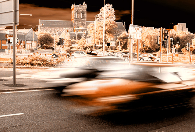
I can't put my finger on why, but there's just something about this one that I rather like. Everything about it looks wrong, but it works in a sort of over-processed artsy way. I will be surprised if it fares well with the other voters, though. Good luck!
I think the concept is cool and the editing is really interesting (in a good way), but there's too much distraction in the background for me. Primarily, the distractions are all the sign and lamp posts. Even though the subject is wonderful ... it looks like a race! I just keep getting drawn back to the stuff in the background that doesn't belong there. Sorry.
Definately see the motion blur here, however it's a subject that's often done. The backround and processing for this photos are very unique. Super amounts of contrast between the ground and the sky. Perhaps a little too much processing in my eyes, this is starting to get into digital art rather that what I would recognize as a photograph.
I like the processing of this and the intersection. Stasis and motion are both in the photo, each enhancing the other. I think this is greyscale gradient editing - but probably wrong. It is fascinating the effect. I tend toward playing with the colouring of this and adjusting to the more blue or grey/black colours myself. Nice work. 8.





 Add photograph to your favorites
 Add photographer to your favorites


 Photographer found comment helpful.


