| Author | Thread |
Comments Made During the Challenge  |
|
|
07/28/2002 10:15:00 AM |
|
Hey I saw this print on the post office wall! |
|
|
|
07/27/2002 01:06:00 PM |
|
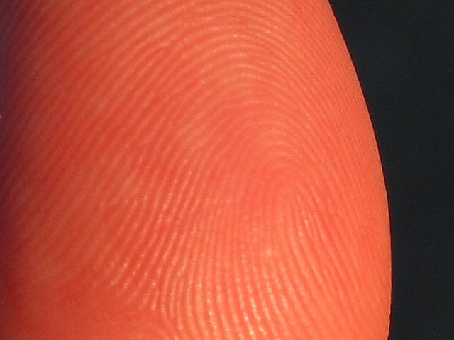
The left side doesn't seem as in focus as the center is... I think more DOF is required, trying playing with your aperture. |
|
|
|
07/27/2002 02:10:00 AM |
|
Strange coloring. 5 sjgleah |
|
|
|
07/26/2002 09:30:00 PM |
|
Not sharp enough and the lighting is to head on. Side lighting would make the texture stand out more. |
|
|
|
07/26/2002 01:40:00 AM |
|
|
|
07/25/2002 10:46:00 PM |
|
This is really neat texture... It seems that the focus on the thumbprint texture may be a little weak and I see some signs of jpeg compression in the bkack area of the photo... I think you need a little larger file size to remove some of this... = 7 - jmsetzler |
|
|
|
07/25/2002 05:22:00 PM |
|
good texture, nice black background, but the thumb looks slightly out of focus. did you get closer than your camera allows? mine often does that ... it beeps as if it has focused, but in reality it has failed ... -- gr8photos (4) |
|
|
|
07/25/2002 03:51:00 AM |
|
I like the idea -- I want to see a spaceship in orbit over there on the right... |
|
|
|
07/24/2002 05:13:00 PM |
|
Good representation of testure. I personally would prefer better focus and less flash glare. 5 |
|
|
|
07/24/2002 11:54:00 AM |
|
good texture study! Your choice of title helped me relate to the picture. |
|
|
|
07/23/2002 11:56:00 AM |
|
Seems a little out of focus |
|
|
|
07/22/2002 11:27:00 PM |
|
I like the simple composition, but the skin tone is a little orangy to me. karmat |
|
|
|
07/22/2002 04:43:00 PM |
I'm wondering if you couldn't have gotten more detail out of this with less compression. the picture looks a bit flat to me and I guess that might be less of an issue if the file was larger/jpeg quality higher. tell me if I'm wrong.
5 beegee |
|
|
|
07/22/2002 02:10:00 PM |
|
|
|
07/22/2002 12:44:00 PM |
|
It´s out of focus, and composition isn´t very interesting. The shadow on the left doesn´t look like a planets one, at least for me. But nice idea. |
|
|
|
07/22/2002 06:40:00 AM |
|
|
|
07/22/2002 03:30:00 AM |
|
so who lives on planet thumb. thumbidians? good texture. you could have brought out the grooves a lot more had you lit it from the side. |
|
|
|
07/22/2002 01:02:00 AM |
|
I liked the title... a little unfocused |
|
Home -
Challenges -
Community -
League -
Photos -
Cameras -
Lenses -
Learn -
Help -
Terms of Use -
Privacy -
Top ^
DPChallenge, and website content and design, Copyright © 2001-2026 Challenging Technologies, LLC.
All digital photo copyrights belong to the photographers and may not be used without permission.
Current Server Time: 06/28/2026 03:58:43 AM EDT.