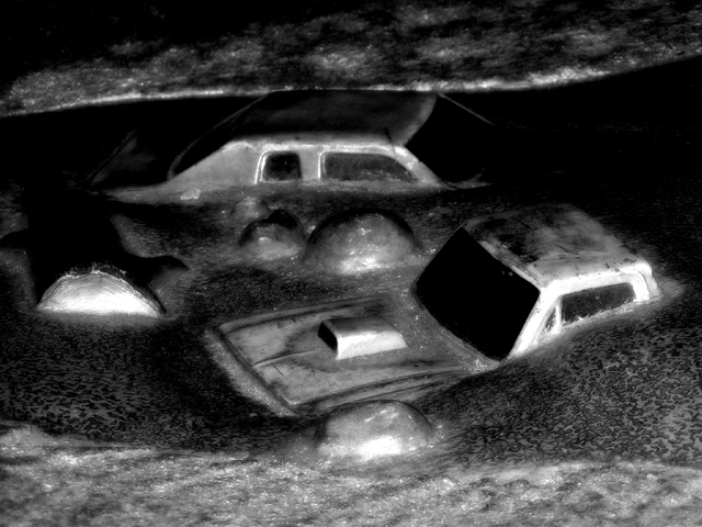
The monster truck pit at Great Adventure. This is what the remote control trucks run over. Converted to B&W, sharpened, resized, baddream filter run (this only burns the darks and dodges the lights). No pixels were moved or added in the making of this picture!
after challenge: I added the unedited color version of this to my portfolio and a perspective shot since a lot of people didn't get what it was. These are concreted into the ground, so it's not noise in the photo that you see.
Statistics
Place: 163 out of 197 Avg (all users): 4.9744 Avg (commenters): 5.9375 Avg (participants): 5.0241 Avg (non-participants): 4.9375 Views since voting: 758 Views during voting: 306 Votes: 195 Comments: 21 Favorites: 0
I think this could work really well with the challenge, but looks a bit like a kid's toy, just made out of one piece of plastic, and in this way may have worked better if you made the set yourself.
I think it needed a little more sharpness, and perhaps a slight wider angle - not sure tbh as it doesnt really "grab" me, and even after looking at your original& perspective, I'm still not entirely sure what I'm looking at. Sorry! (As a kinda excuse, I've only ever seen monster truck rallies on the Simpsons! :P)
my whole problem with this one is the effect you have added. i think the cars in the flood is great..... B&W is great.... just not that fuzzy stuff. lol.
I would like to have seen this be a bit sharper. I like the idea a lot and the composition is good. B&W is a good choice given the subject matter. I would have given this a 5 if I had been able to vote. It's just to blurred for my taste.
Trading Post - Interesting to see them in color and with more of a true perspective. I did think it was just odd noise that was contaminating the shot. Anyway, the shot left me a bit flat. The shadows seemed a bit harsh and the texture was not pleasing to me. Overall the shot didnt hold much interest for me. In challenge I figured it was just really bad postprocessing and voted according to that. Very tough challenge to rate as the pics were meant to leave one feeling down.
This feels very desolate! Definitely works well in B&W. The color version is kinda cool, too, but this is definitely more suited to the challenge. I like overall composition - can't see anything I'd change on it. Technically I suppose some might want it a bit sharper, but I like it soft - gives it a dreary feel, which is pretty much what I think you were after. Really should have scored higher.
I'm not sure how I feel about the overall look of this. it's a cool concept and may have been better with more realistic coloring. not totally realistic but a happy medium.
I have no idea how this was done, or what it is meant to depict. Does it depict "Desolation"...Possibly, but I do not believe this will score all that well. Good luck to you.
Okay, here goes. I gave you a 7 (one of the few I did rate). And I was going to comment but I had to eat. I so love the surrealness of this image. And I love that, while its in black and white, it doesn't look like a black and white image. I don't know how to explain that but trust me.
Why it isn't scoring well? You have to ask? DPC craves the bright and shiny. This is neither - lose 2 points for that. DPC prefers simple - this isn't that - lose another point. DPC likes vibrant color - none here - there goes another point. DPC wants a vision that requires no interpretation and if it does require one that it doesn't detract from the feel good moment - minus one for missing that. Where are we at? 5? Add in the number of people that are scoring you down for does not meet challenge and your score should reside between 4.3 and 5.3. Am I close?
So, why did I give you a 7 and not anything higher? My scoring allows 2 for meet challenge, 4 for technicals, 4 for emotion. I gave you 4 for emotion, 1 for meeting challenge, 2 for technicals. The contrast isn't as high as I'd like it and the point of view and focus are slightly off and the cars look a little bit fake. But its a really cool image. :)






 Add photograph to your favorites
 Add photographer to your favorites

 Photographer found comment helpful.


