| Photograph Information |
Photographer's Comments |
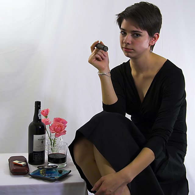
Challenge: Indulgence (Basic Editing III)
Camera: Nikon D50
Lens: Nikon AF Zoom-Nikkor 28-80mm f/3.5-5.6
Location: Studio, Philadelphia, PA
Date: Jun 13, 2006
Aperture: f/4.5
ISO: 400
Shutter: 1/20
Galleries: Emotive, Portraiture
Date Uploaded: Jun 13, 2006
|
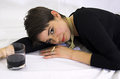
I spent an hour with this beautiful thespian friend of mine this afternoon and I think we got some good images. Being my first time having a model I'm quite excited, but I'll temper my excitement until the end of the week when voting is done My guess 6.1. ;)
I was trying to get a sultry look for this image. I'm concerned about 2 things with the image. First, people are going to complain about her chopped hand. Second, the lighting/shadow on her left check from her shoulder.
Editing: RSE (WB, Exposure comp +1/3, Bumped up Saturation), PSE (Neat Image, Crop, Unsharp Mask, Levels, Desaturate Reds)
POST CHALLENGE: I really should have named this, "Do you mind? I'm busy here," Not one person got the connection between her sultry, annoyed look and her indulging herself. YES I KNOW SHE LOOKS ANNOYED! THAT WAS THE POINT! ;)
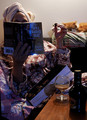
Outtakes:
   |
| Author | Thread |
|
|
06/21/2006 03:28:43 PM |
|
Just my two cents, but you've over NI'd this shot. Portraits rarely look natural with NI applied. Other than that I like the shot and the model is smokin' ;-) |
|
 Photographer found comment helpful. Photographer found comment helpful. |
Comments Made During the Challenge  |
|
|
06/20/2006 10:01:41 PM |
|
Technically good, perhaps a little less shadow on the face. There is an odd highlight on the left side of her face that looks out of place. Composition is good, but I think a little busy. You didn't have to include all those objects to convince me. 7 |
|
| Photographer found comment helpful. |
|
|
06/20/2006 04:01:42 PM |
|
Sorry , but this photo doesn't do anything for me, in anyway. Lighting isn't attractive, model looks like she is mad she has to pose for you, obvious studio props.... |
|
| Photographer found comment helpful. |
|
|
06/18/2006 10:03:57 AM |
|
Great idea. It may be easier for the model to picture indulgence by looking away from the camera. |
|
| Photographer found comment helpful. |
|
|
06/17/2006 01:23:59 PM |
|
model should look happier at this indulgence? also better lighting/composition could have made it brilliant |
|
| Photographer found comment helpful. |
|
|
06/17/2006 09:12:58 AM |
|
This is not a port glass. |
|
| Photographer found comment helpful. |
|
|
06/16/2006 04:30:18 PM |
|
This is a nice idea and I like the effort put in but the finished product isn't quite there for me - the backdrop is too sharply in focus which means I can see every crease and wrinkle. The model looks uncomfortably hunched up on a teeny tiny stool or is she sitting on the floor. And most of all her expression just looks slightly embarassed/ annoyed rather than conveying the joy of all her indulgent pleasures. |
|
| Photographer found comment helpful. |
|
|
06/15/2006 05:31:27 PM |
|
Oh, she looks real impressed. |
|
| Photographer found comment helpful. |
|
|
06/15/2006 05:25:41 PM |
|
| Photographer found comment helpful. |
|
|
06/15/2006 02:08:25 PM |
|
Table looks a little cluttered |
|
| Photographer found comment helpful. |
|
|
06/15/2006 12:41:56 PM |
|
She looks a little skeptical that this is an indulgence! Excellent capture |
|
| Photographer found comment helpful. |
|
|
06/14/2006 11:49:49 PM |
|
Erm, you're model doesn't look to thrilled! I feel like her face could use a touch more light. A reflector I think would help with that. Nice port! |
|
| Photographer found comment helpful. |
|
|
06/14/2006 04:00:53 PM |
|
the image is very strong but the model's expression kind of ruins it. Sharpness, DOF, POV, comp. all work well. |
|
| Photographer found comment helpful. |
|
|
06/14/2006 11:41:36 AM |
|
| Photographer found comment helpful. |
|
|
06/14/2006 01:03:31 AM |
|
Nice idea but the face of the model is too shadowed. |
|
| Photographer found comment helpful. |
|
|
06/14/2006 12:32:55 AM |
|
Definitely meets the challenge - cute idea and unique having a woman with a cigar. I would have liked to see your model have an expression of enjoyment though. The lighting isnt bad - but there is a bit of a shadow across the background above the table. As for the background itself - a few slight wrinkles to the left that dont bother me - but the one running vertical behind the model's head is a bit distracting. I like your choice of composition and the colors involved here. Good luck in the challenge. |
|
| Photographer found comment helpful. |
Home -
Challenges -
Community -
League -
Photos -
Cameras -
Lenses -
Learn -
Help -
Terms of Use -
Privacy -
Top ^
DPChallenge, and website content and design, Copyright © 2001-2026 Challenging Technologies, LLC.
All digital photo copyrights belong to the photographers and may not be used without permission.
Current Server Time: 06/29/2026 08:26:23 PM EDT.