*Critique Club*
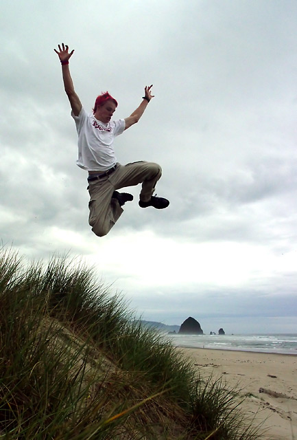
Alrighty, my first reaction is that if you were trying to redo this shot for the motion blur challenge...you failed miserably. HOWEVER, the challenge didn't specify that you had to improve the shot for the original challenge it was entered into. SO...that being said, there are a few things I notice when comparing this to the original.
First off, the focus and clarity of this are much better. Granted, the motion blur WAS the challenge last time, but I have to admit that it improves the shot 10x's for me having the guy in focus.
Secondly, the tilted horizon. You straightened it up in this sequel and it does make a great difference.
I like the grass better in the original though. I think it's because in this shot, the grass is dark, and not very green. I really do prefer the grass from the original.
I notice that you DID improve the score, but not by much. My theory behind that is that while it's a much better image, in my opinion, it simply fit better in the other challenge.
Now, to pick this apart without comparing it to the other one...
Focus and clarity are great. I love the stopped motion of the person.
The background is stunning. Very beautiful.
Lighting conditions do not seem to be ideal. The sky is bland and makes other colors appear dull, as well as the grass seeming dark. Not sure how to improve upon that without taking the shot at a different time of day, or different day all together.
Nice cropping/framing. I like where you have placed the subject within the photo.
Visual appeal for me is high. Love the hair. You could come hang out with US sometime. (me on the left)
Anyway, to sum it up, needs more light. That's all. everything else is wonderful.
~Heather~ |


 /url]
/url]


