This image was submitted in, August 2005, score 5.097, placed 150/292.
The cottage is now part of the Historical Society.
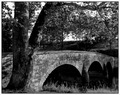
Image taken from the same position,at the same angle.After a good look at old dwellings with timber, beleived B&W was the best way to overcome many of the different discolorings in the timber.
Original Comments.
1.I would have liked to seen this without the sign. Kind of ruins the feeling of being in the period.
2.Blown Sky.
3.Not sure what all the funky blue is in the trees and on the building, but it seems quite distracting. Also, it looks like it was very bright, the sky appears blown out, and there are some bright sun rays present. Perhaps a different time of day would make a difference.
4.Looks like your colour correction went a bit overboard. The wall on the right part of the image is showing weird blue tones adn there seems to be too much green/cyan all over the shed.
Since upgraded to a Canon 8mp Camera.From a canon 4mp.
Photo Shop.
Cloned out distracting sign on front of cottage.and power line.
Align Edges
Color Balance
Levels
Sharpen
Light Dodge on front wall
Resize
Save for web
Shooting Mode
Shutter-Priority AE
Tv( Shutter Speed ):1/400
Av( Aperture Value ):3.5
Exposure Compensation:-1/3
ISO Speed:100
Focal Length:21.0mm
Image Quality:RAW
Flash:Off
Color Space:Adobe RGB
Statistics
Place: 74 out of 161 Avg (all users): 5.9018 Avg (commenters): 7.7143 Avg (participants): 5.6563 Avg (non-participants): 6.0606 Views since voting: 776 Views during voting: 210 Votes: 163 Comments: 8 Favorites: 0
How nice :o) Nice job you did on the colors. The cottage looks somehow clean and neat although it is old and probably not so clean... Love this picture... Well done.
Oh how I LOVE the look of these old, antique, slightly grungy photos! This is awesome! I absolutely love the feel of it! Congratulations, I can't imagine that this isn't better than the other one :)






 Add photograph to your favorites
 Add photographer to your favorites


 Photographer found comment helpful.


