| Author | Thread |
|
|
06/13/2006 05:27:03 PM |
Hey there from the Critique Club
First of all, congrats on your second highest scoring submission to date.
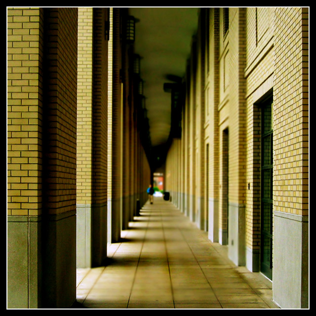
Camera Work/Technical: Excellent focus and wonderful depth of field use. I also really like the tones and coloring that you achieved with this image.
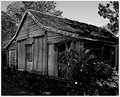
Lighting: The alternating highlights and shadows work well to pull the viewer deep into the image. Looking back at the original I prefer the lighting in that one. This one has a great feel to it, but I prefer the edginess of the original.
Composition/Content: Much improved. I think that the straight-on centered composition works much better for this image. It really helps to pull the viewer's eye deep into the frame with time and desire to observe all the details that you captured.
My Opinion: I like them both, but for different reason. I'd really like to see this particular composition with the edgy lighting and post-precessing of the original image. For both, nice work. Well seen and well captured on two separate occasions.
Eric
|
|
 Photographer found comment helpful. Photographer found comment helpful. |
Comments Made During the Challenge  |
|
|
06/12/2006 02:21:01 PM |
|
I liked the original better, more edgy and grungy looking. This is too clean for my taste. a 6 |
|
| Photographer found comment helpful. |
|
|
06/10/2006 12:28:43 AM |
|
Good use of the dof blur. |
|
| Photographer found comment helpful. |
|
|
06/08/2006 06:57:00 PM |
|
I like the play with the blurry effect. I works well here. Nice perspective and light, too. |
|
| Photographer found comment helpful. |
|
|
06/07/2006 12:51:25 PM |
|
nice shot. I gave it a 7. When you made it diagonal, I gave it a 9. |
|
| Photographer found comment helpful. |
|
|
06/06/2006 02:42:30 PM |
|
| Photographer found comment helpful. |
|
|
06/06/2006 02:38:19 PM |
|
I'm guessing that since you included the number for the first photo you were hoping for people to compare. I took a different approach, because I wanted to give an unbiased a vote as possible. But I am now trying to go back and compare wherever possible. This photo is very good on its own and is a defiante improvement overall. I like the fading DOF and I think the color tones are awesome. Great job! |
|
| Photographer found comment helpful. |
|
|
06/06/2006 01:26:38 PM |
|
Really interesting photo. I like it. |
|
| Photographer found comment helpful. |
|
|
06/06/2006 12:53:50 PM |
|
Nice pic, I like the blurring for it surreal effect. |
|
| Photographer found comment helpful. |
|
|
06/06/2006 01:00:23 AM |
|
Great use of shallow DOF and leading lines. This is a perfect example of a successfull centered composition. |
|
| Photographer found comment helpful. |
|
|
06/06/2006 12:23:21 AM |
|
Compositionally and in color/tonality this is a heck of a lot better :-) |
|
| Photographer found comment helpful. |
Home -
Challenges -
Community -
League -
Photos -
Cameras -
Lenses -
Learn -
Help -
Terms of Use -
Privacy -
Top ^
DPChallenge, and website content and design, Copyright © 2001-2026 Challenging Technologies, LLC.
All digital photo copyrights belong to the photographers and may not be used without permission.
Current Server Time: 06/28/2026 10:04:41 PM EDT.