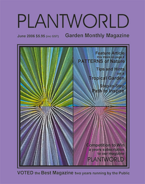
I like to echo the comments you have already gotten but I think I would have liked the front page better if the purple around the phot were just white, the purple that is the backround color kindof draws away from the impact of the beautifully symmetrial photos of the flower and I think I would notice the front page much better in a store if it were like that. The font is good :)






 Add photograph to your favorites
 Add photographer to your favorites

 Photographer found comment helpful.


