| Author | Thread |
|
|
06/13/2006 08:15:59 AM |
|
A definite improvement...congrats. You are doing so well lately. |
|
 Photographer found comment helpful. Photographer found comment helpful. |
|
|
06/13/2006 02:34:11 AM |
::: Critique Club :::
Hi, my name is Kari and from the critique club.
First Impression - the most important one:
Way improved .. and previous comments acted on in the right way.
Subject:
This definately meets the challenge ... and contains a serious jump in the scoring.
Composition:
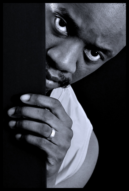
I think that the door lines down the thirds works well .. but also the way that the face is angled creates a leading line through the side of the pictura. The eyes are great ... in that they force you to remain in touch with the subject ... it ensures a second look.
Technical (Colour and light):
This has shown a vast improvement .... you have lightened the scene incredibly well .. and that in itself is fantastic ... you have also sharpened but not overused that tool.
To grow its vote?:
Well you have by heaps so far ... so not sure of the next step ... I think that maybe a slightly wider shot or more space above the eyes to have them working the horizontal thirds .. may work.
Summary:
Great work .. good taking on board comments received. Well done keep it up.
If you've got any questions about this critique, please feel free to contact me via the PM system.
Cheers
Kari |
|
| Photographer found comment helpful. |
|
|
06/13/2006 12:07:25 AM |
|
Excellent! I liked the original, and the tweaks you've done reallyu make this an excellent picture! |
|
| Photographer found comment helpful. |
Comments Made During the Challenge  |
|
|
06/12/2006 11:18:57 PM |
|
Definitely better than the original. This is sharp and the contrast is perfect. Great job and great improvment my friend ;) |
|
| Photographer found comment helpful. |
|
|
06/12/2006 10:02:41 PM |
|
Youre on a roll. Good luck! |
|
|
|
06/12/2006 09:24:21 PM |
|
SherwinJames! You really listened to those suggestions! And before I even looked up the original this was a 9 in my book but seeing the improvement in the shot it's going to a 10! :) Very well done! |
|
| Photographer found comment helpful. |
|
|
06/12/2006 02:47:30 PM |
|
Like the composition, great shot! |
|
| Photographer found comment helpful. |
|
|
06/11/2006 01:55:32 PM |
|
I'm not familiar with the original, but I do like this one! Good lighting, I like the composition. Fingernail seems a bit blown, maybe? Ever so slightly distracting but only if you manage to get away from those eyes. |
|
| Photographer found comment helpful. |
|
|
06/10/2006 12:40:53 AM |
|
|
|
06/09/2006 05:20:10 PM |
|
| Photographer found comment helpful. |
|
|
06/08/2006 03:51:03 PM |
|
Now this is a portrait! Great expression, and lovely light setup! 10 |
|
| Photographer found comment helpful. |
|
|
06/08/2006 04:43:00 AM |
|
You talk'n 'bout Shaft? Well done. |
|
|
|
06/07/2006 08:06:29 PM |
|
Very strong image here... |
|
| Photographer found comment helpful. |
|
|
06/07/2006 03:52:07 PM |
|
|
|
06/07/2006 01:50:58 PM |
|
Nicely done... Liked the first one also. |
|
|
|
06/06/2006 11:57:39 PM |
|
Much better...good job. Focus is dead on and lighting is wonderful. Not voting yet, just wanted to comment before I forget! |
|
| Photographer found comment helpful. |
|
|
06/06/2006 06:49:28 PM |
|
Fantastic composition and wonderful b/w really nice work! |
|
| Photographer found comment helpful. |
|
|
06/06/2006 03:46:27 PM |
|
I wanted to vote without seeing the originals first, I thought my vote would be more unbiased that way. So now I'm trying to back through and compare the ones that I can, just to see. I'd have to say this is great improvement and the first go around wasn't bad, much better tonal qualities this time. I even managed to get the voting right. Great job! |
|
| Photographer found comment helpful. |
|
|
06/06/2006 01:22:52 PM |
|
Nice shot, good idae to use these tones aswell, they work well. |
|
| Photographer found comment helpful. |
|
|
06/06/2006 10:32:39 AM |
|
your commentors were wrong. the original was better, more mysterious. one must hide in order to reveal. |
|
| Photographer found comment helpful. |
|
|
06/06/2006 03:16:00 AM |
|
The ring distracts me but other than that, good photo. |
|
| Photographer found comment helpful. |
|
|
06/06/2006 12:16:04 AM |
|
I like this version much better! |
|
Home -
Challenges -
Community -
League -
Photos -
Cameras -
Lenses -
Learn -
Help -
Terms of Use -
Privacy -
Top ^
DPChallenge, and website content and design, Copyright © 2001-2026 Challenging Technologies, LLC.
All digital photo copyrights belong to the photographers and may not be used without permission.
Current Server Time: 06/29/2026 03:32:06 AM EDT.