| Author | Thread |
|
|
08/30/2003 04:40:57 PM |
Critique Club once again
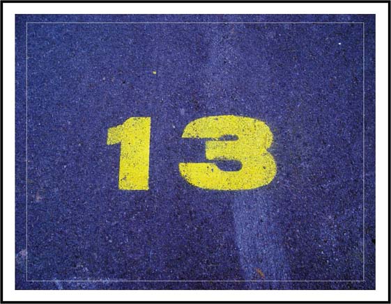
Greetings to Iceland. You've met the challenge with this photo, lots of negative space around your main subject. I gave you a 7 for this pic because I like the yellow/blue combination.
What kind of hit me on the negative side about your image is that you centered the 13. It is exactly in the middle and I would have prefered to have seen it in one of the corners. You know, rule of thirds etc. I also think the border is a little overwhelming and pulls me away from your pic too much.
You certainly didn't deserve the 1's, 2's and 3's you got here.
See ya
Gary |
|
 Photographer found comment helpful. Photographer found comment helpful. |
Comments Made During the Challenge  |
|
|
08/20/2003 01:17:55 PM |
|
Front and center, the 13 takes the stage and makes the negative space almost invisible, which is an okay choice. I'm sure you've tried moving it to a third. This would allow the negative space to speak beyond the frame of the photo and into this 13's world that we don't see. Different choice, different effect, but perhaps worth experimenting with. |
|
| Photographer found comment helpful. |
|
|
08/19/2003 01:44:07 PM |
|
Cleaver use of the number and assignment theme. I think your choice of negative space (and colors) make the number pop. Well done. |
|
| Photographer found comment helpful. |
|
|
08/18/2003 06:13:19 AM |
|
would work well off-center. Try moving it around, or recropping it if you can |
|
| Photographer found comment helpful. |
|
|
08/18/2003 12:44:27 AM |
|
c'mon now.. this isn't a negative number.. nice framing though |
|
| Photographer found comment helpful. |
Home -
Challenges -
Community -
League -
Photos -
Cameras -
Lenses -
Learn -
Help -
Terms of Use -
Privacy -
Top ^
DPChallenge, and website content and design, Copyright © 2001-2026 Challenging Technologies, LLC.
All digital photo copyrights belong to the photographers and may not be used without permission.
Current Server Time: 06/28/2026 10:11:17 PM EDT.