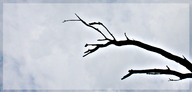
The branch is quite dark as compared to the rest of the photograph. I'd almost see that as the negative space. The glow around the branch is distracting, however, and detracts from the overall.
What weird glow is that around the branch? I do not like the frame.
I´m sorry but that glow looks too weird for my, looks photoshopped. Hope I´m wrong though.
I see you had a very interesting idea. However, a few elements may improve the image...
Firstly, the bright white ring around the branch doesnt work for me. Try using 0 or a very small number of pixels when deleting background as you can immediately see that it was layered on. also, silhoettes do not work well with outlines.
Secondly, perhaps you could have get a few more branches? As at the moment, I do not think that the subject is interesting enough.
Lastly, I know you cannot control weather, perhaps selecting a sky area with a little more blueness. I know that a negative space is meant to be quite uniform, but this section of sky does not give the image the WOW factor.
Image looks a bit too treated for me and the border and 'glow' spoil what would be a good, simple composition. Branch & border have too much saturation of blue & magenta making it look harsh.
The border and the glow are perhaps a little too much post-processing. A more natural shot showing the texture of the tree bark against the clouds would have more appeal for me.






 Add photograph to your favorites
 Add photographer to your favorites


