Hey there from the Critique Club
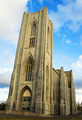
Camera Work/Technical: Nice focus, but I think a deeper depth of field would help. I'd like to clearly see the columns in the background as well.
Lighting: Your lighting is a little flat. The shadows in the column heads help out a bit, but this one needs a bit more contrast.
Composition/Content: The centered composition hurts this one. Perhaps standing a bit either side would have made this one even more appealing.
My Opinion: I think that you met the challenge well, and that this one scored close to its potential.
Eric
|







 Add photograph to your favorites
 Add photographer to your favorites

 Photographer found comment helpful.


