| Author | Thread |
Comments Made During the Challenge  |
|
|
05/25/2006 08:00:17 PM |
|
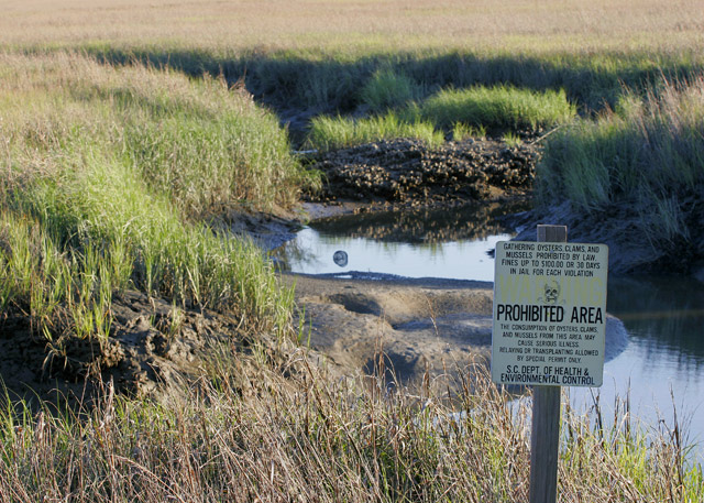
I like the idea, and I think that you meet the challenge, but there really isn't enough emphasis on the sign. I think a tighter composition with a more shallow depth of field would help direct the viewer more toward the warning, while still seeing a blurred environment in the background. |
|
 Photographer found comment helpful. Photographer found comment helpful. |
|
|
05/24/2006 09:38:31 PM |
|
| Photographer found comment helpful. |
|
|
05/24/2006 08:57:01 AM |
|
I would have liked to see less grass at the top and a closer zoom in on the sign. I had to really strain to see what the sign said. Like the idea though. |
|
| Photographer found comment helpful. |
|
|
05/24/2006 02:27:17 AM |
|
Looks JUST like one of my marshes :-) But I see you're in S.C. |
|
| Photographer found comment helpful. |
|
|
05/24/2006 01:19:00 AM |
|
I think some Levels and Curves adjustments would have made this pop a little more. |
|
| Photographer found comment helpful. |
Home -
Challenges -
Community -
League -
Photos -
Cameras -
Lenses -
Learn -
Help -
Terms of Use -
Privacy -
Top ^
DPChallenge, and website content and design, Copyright © 2001-2026 Challenging Technologies, LLC.
All digital photo copyrights belong to the photographers and may not be used without permission.
Current Server Time: 06/28/2026 09:24:35 PM EDT.