| Author | Thread |
|
|
05/20/2006 09:37:23 PM |
Greetings from the Critique Club...
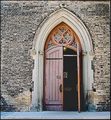
Interesting image. What I like best is the detail you captured on the roof and how you enhanced it in PP. By itself it would make for a good texture image in it's own right.
As for the rest of the image, it looks fine however the grass kinda bugs me to be honest. I can see you did a lot of burning but I don't understand why you did more of it on the right side and not the left. If you wanted to leave in some detail I think you shouldn't have burnt the grass tips so much that way there wouldn't be that harsh transition in the grass.
Overall, the image is good. I think you did as much as you could to bring out it's appeal. However, I feel that appeal was simply limited. What might have produced more appeal would be to have more of the roof in the shot (wider angle?) and if there was a cross up there to have it in the shot as well. I just don't feel that these windows have enough appeal to carry the shot by themselves. Maybe if they were stained glass that would have been a different story.
|
|
Comments Made During the Challenge  |
|
|
05/16/2006 11:18:58 PM |
|
I love how the roof and the grass seem flat. 7. |
|
|
|
05/12/2006 03:10:10 AM |
|
I love the effective understatement of the gothically arched windows. If it were not for them, you could have substituted 'cottage' for 'church' in the title. |
|
|
|
05/11/2006 08:03:30 PM |
|
Interesting subject and good texture. I might like to see the wall darkened up a bit as it seems a bit overexposed and it might be neat to do a tight crop on the windows. Nicely done. |
|
|
|
05/11/2006 08:13:45 AM |
|
Very pretty. The white backround seems slightly washed out under the middle window. |
|
|
|
05/11/2006 08:09:20 AM |
|
would have liked to have seen more of the church |
|
|
|
05/11/2006 07:42:23 AM |
When I first glanced at this, I thought someone was standing inside, behind the middle window....a bit spooky. But on closer examination, I realized it was just the window on the other side of the church.
lol - guess I need my glasses adjusted. |
|
|
|
05/10/2006 10:29:12 PM |
|
|
|
05/10/2006 07:38:48 PM |
|
The windows are pretty. Not overly exciting though. |
|
|
|
05/10/2006 01:53:20 PM |
|
Not sure if it is slightly out of focus or if it's the post processing creating that effect. The textures are nice but it is sort of a bland photo with not a lot of interest. |
|
|
|
05/10/2006 12:03:24 PM |
|
I like this for it's simplicity. Nice lines in the composition. The repeating pattern with the windows works well. Borders are usually a give or take with me. In this case a border might have helped to "contain" the image some. Just a thought. Good luck in the challenge. |
|
Home -
Challenges -
Community -
League -
Photos -
Cameras -
Lenses -
Learn -
Help -
Terms of Use -
Privacy -
Top ^
DPChallenge, and website content and design, Copyright © 2001-2026 Challenging Technologies, LLC.
All digital photo copyrights belong to the photographers and may not be used without permission.
Current Server Time: 06/28/2026 04:38:15 AM EDT.