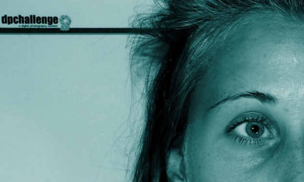
CTPII Not a bad photo, sir. It's just that your concept seemed not too well thought of -- as the DRIVING PEOPLE CRAZY tag wasn't particularly evident in your shot. Also, the blue duotone seemed a random choice for PP. Sorry if I'm making assumptions here, but that's what I see.
Point of improvement: a different facial expression on the face, and a huge bump up in the contrast department. With that, i guess you could keep the blue duotone.
Good luck on the next challenges!
Hey, that's what my title was! GREAT TITLE!! lol. I love the DPC line too. Very clever.
I'm not sure I love the blue duo-tone effect all that much. That's just me, though.
Also, your sujcet looks calm and collected, instead of crazy.
I'm still chuckling over your idea though.. I know dpc drives me crazy sometimes.
First Impression: Sorry for the score, but it doesn't seem of DPC's taste.
Composition: Not bad, but the face, in which you can see part of the nose is a bit strange. I mean, it would be better if the entire nose was in the image or nothing at all.
Subject: The idea is great. But the lady doesn't seem crazy.
Technical: the duotone is nice, but blue is a color that transmits peace, quietness, and not crazyness. Maybe a duotone in oranges or reds would work better for your idea. The light of the face is a bit harsh.
There are a lot of things here that hurt you, IMO. Don't get me wrong it's mostly due to what DPC voters wanted to see vs what you gave them.
For starters, I agree with Becky in that this was a crazy challenge to vote on. I think going in people expected to see "poster like" images shot in portrait even though this wasn't a poster challenge. Personally, the landscape orientation didn't bother me. However to be honest I didn't care much for the coloring but that's just me. I also would have liked to see more of a crazy reaction from the subject to match the title. Say pulling her hair out?
All in all this was a really good idea much better than mine. So big props on that.
Despite what others have said, I don't think the blue colorizing is a bad choice. This was a totally wonky challenge for voting, so I think your photo suffered in a few places. First, the landscape orientation in a challenge about movie posters, which was the subject of a lot of debate in the forums. Second, looking too edited because of the colorizing - I think a lot of folks probably didn't take too well to anything that started to look too much like it wasn't that way straight out of the camera. And possibly the DPC tie in was just a little too precious, though I think it was a cleverer take on the title than others had. Lastly, the fact that so many others had the same title likely hurt your score a little, but there was really no way to predict that would happen - luck of the draw on that one.
As to the photo itself, there are some blown out spots on the forehead and under the eye, and a stray hair running to the eyebrow that might have been cloned out. The DPC logo isn't totally in focus. And perhaps the "craziness" implied in the title isn't fully evoked. Would I get that element without the title? I'd probably guess tired and sleepless over crazy.
I scored 168th, so you're in good company down here in the 17th percentile. ;-)
I find the blue monotone to be a bit too sedate to convey "crazy." Also, the model's expression is a bit bland. A wider-open eye looking straight at the camera would have communicated better.
a very blair witch feel. I like the concept. the title and image work together fairly well. I don't care for the blue hue, maybe a darker yellow hue would work better. the eye should be bloodshot to show more of a crazy feel. the hair could be crazier and take up some of the space in between the logo and the subject.
what I am looking for in this challenge is for a creative 'wow' shot that would go on a movie poster. I think that's what the challenge is all about...this is excellent and looks great as a duotone. It has that psycho look about it






 Add photograph to your favorites
 Add photographer to your favorites

 Photographer found comment helpful.


