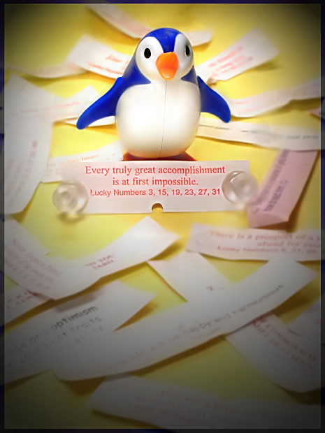
A daring, diminutive, and doggedly determined plastic penguin named Periwinkle completes a Chinatown caper with passion and aplomb.
Tag line: "Every truly great accomplishment is at first impossible." A quirky inspirational story for the whole family. Like "The Little Engine That Could." Except with a penguin. And fortune cookies. You'll have to watch the movie to understand how they come together, obviously ;-)
I don't know how this will fare in competition, but I designed it to look like a movie poster rather than something that absolutely hits the title in the forehead like a cast-iron skillet. I'm hoping it conjures a little intrigue, which is what gets butts in those $7 seats.
Rotate
Crop
Yellow saturation
Brightness/contrast
Selective red saturation on tag line fortune paper to increase legibility
Gaussian blur on everything but the penguin and the tag line fortune to direct focus
Cloned out shiny spots on penguin's head
Sharpen
Filter: Render: Lighting Effects: Spotlight (to cure washouts at bottom and further direct focus)
Add noise to match the noise surrounding penguin with the gaussian blurred area since the blur eliminated that noise
Neat Image (finally got that one in my repertoire!)
Border was achieved by cutting a slightly smaller layer and adjusting hue and darkness on bottom layer.
Flattened, resized, saved for web at 94%.
I wish y'all could see my brilliant alliteration during the voting phase - I'd win for my vocab skills alone! ;-)
---
Post-challenge, I think that this suffered for looking too edited, and perhaps a bit because people were confused. You don't look at this entry and immediately "get it", and I didn't design it to do that. I've always thought a movie poster should create more questions than it answers. The title initially was "The Determined Penguin Caper", but the article was dropped after a whole bunch of voters decided pre-challenge to penalize for article use, and grammatically it just doesn't feel completely right without it. It's truly unfortunate that so many people were willing to mark down for something that wouldn't even get indexed.
None of my favorites in this challenge did well, actually. I didn't expect to win, and I don't think this is deserving of 166th place given what the challenge was meant to be, but gather from the constant argument over it in the forums that no one really ever came to an agreement on what it was supposed to be anyway, and the result is a rather perplexing finish.
Statistics
Place: 167 out of 207 Avg (all users): 4.9796 Avg (commenters): 6.0000 Avg (participants): 4.7732 Avg (non-participants): 5.1818 Views since voting: 1156 Views during voting: 302 Votes: 196 Comments: 11 Favorites: 1 (view)
After a quick flick over all your other post-challenge comments, I realise that what's to be said has already pretty much been said by other alternate clubs. For the most part I agree with them.
Your composition is effective and, as you say, creates more questions than it answers. The 'tag line' of the image works well to bring original thoughts about your photograph into perspective a little and bring down some of the chaos.
I think the main part of the image I would change would be, as stated earlier by other people, the yellow base. It doesn't compliment, but clashes with the colour of the penguin. Perhaps a more vibrant yellow or no yellow at all would be better...
As someone else said, the lighting could also be improved. Always go for long exposure rates over flashes and spotlights.
A good point to note though, is your use of depth of field. The way that the penguin and tagline remain in clear focus, while the other slips of paper are blurred works very well to direct the viewer's focus into the centre and subject of your image.
I'd say that, with the exception of lighting, your skill with a camera is fine and looking at some of your other images proves this point even more. Just a little more attention to what's actually being photographed may be necessary. Remember that people tend to be more critical when a composition that is under one's control isn't too great. If you wanted to play to your strengths, keep going with some of those amazing nature scenes such as your 'window framed' image in Colorado Springs.
First Impression Good idea, not so good execution.
Composition: Composition is fine.
Subject: I like the subject. The challenge is such that not many entrants met the criteria. This is do exception, doen't look like a Movie poster/promo.
Technical (Colour and light): The color and lighing needs some improvement. Flat lighting, Contrast and colors takes away a lot from this picture. Not sure if yellow color also works with the picture.
Improvement: Other than Yellow color for base, more contrast, more lighting. Instead of putting subject on flat surface, try a curve. I was using the flat surface earlier. I learned that if you want base and BG same color, can be achieved using a paper poster board with the curvature.
Summary: Average image with lack of lighting and contrast.
Cute idea, and I like the way the title on the fortune cookie ties in to the theme. This has more impact when you read your movie description. Otherwise it doesn't look all that 'movieish'.
The colors could be a bit more vibrant (especially for DPC tastes). The soft yellow and pink and white are, well, soft. The blue of the penguin does contrast nicely, though.
Focus and depth of field are both good, and the way you set this up is very creative. I especially like that you thought out the whole movie plot etc.
I don't have any 'improvement' ideas. You executed your idea very nicely.
It's a very nice family movie poster:)
Maybe if the Penguin and tag line were at the bottom?
Maybe the dark around the edges takes away from the beautiful colours?
Overall I think its great and you should be very proud of it. It's very creative:)
First Impression: Very cute. I thought this hit the challenge to a tee.
Composition: Works perfectly for this challenge and for the image in general. I probably would have used the vignetting only at the bottom so the top part is more clear and vibrant.
Subject: The subject stands out in the composition but as mentioned above could have popped more without the darken corners.
Technical (Colour and light): The lighting is good and the color is very colorful. The focusing works however, that might have been an issue with voters who crave super sharp images. However, as an image for a movie poster it worked, IMO.
Improvement: Really, nothing beyond just trying to cater more to what DPC voters want. In other words, sharper is better, bolder colors is better and the more alive the subject is (i.e. inanimate vs living breathing) the better.
Summary: Good image for the challenge. I scored this a 6 which would have placed this around 60ish overall in my overall placing. Good job and better luck next time!
Cute photo, the dodge/burn treatment really focuses the attention on the subject, but seems a little extreme in the corners. Doesn't transition smoothly, might be a better way to say it. The composition and arrangement are good also.
This is a poster for a 70's crime dramedy about a bunch of losers who make big plans in a Chinese Restaurant and what happens when they finally decide to go for it. Ok, you win. I'll go see the movie!