| Author | Thread |
Comments Made During the Challenge  |
|
|
05/14/2006 01:12:13 PM |
|
 Photographer found comment helpful. Photographer found comment helpful. |
|
|
05/14/2006 02:19:34 AM |
|
Very nice useage of sephia in the recreation. This is a worthy image. 10 in my book. |
|
| Photographer found comment helpful. |
|
|
05/13/2006 10:32:06 AM |
|
| Photographer found comment helpful. |
|
|
05/10/2006 10:21:34 AM |
|
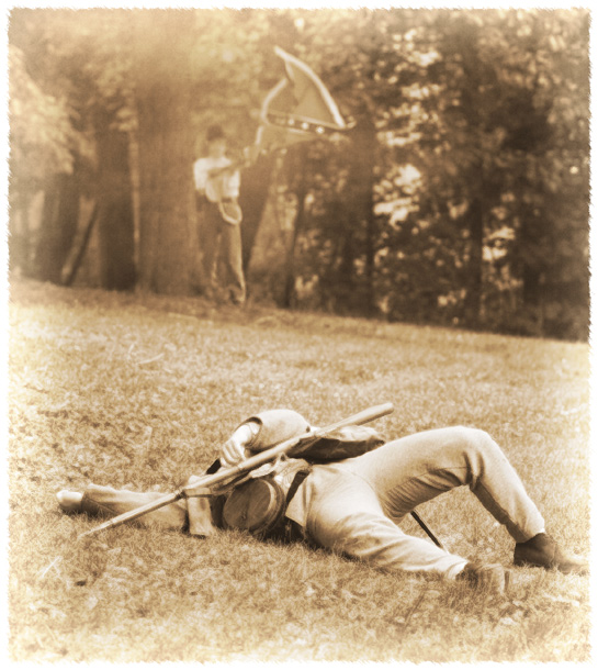
The tones and border work well for this(and i usually hate borders). Good job overall but I think maybe his uniform is a little washed out. |
|
| Photographer found comment helpful. |
|
|
05/09/2006 02:17:11 PM |
|
The antiquing is a good idea and seems very appropriate, not a big fan of the lightening around the edges though. Great composition and subject matter. Looks like there was a lot of gunsmoke in the air. Well done! |
|
| Photographer found comment helpful. |
|
|
05/09/2006 01:33:34 PM |
|
Nicely antiqued photo...unless, of course,...you used a DeLorian! :) |
|
| Photographer found comment helpful. |
|
|
05/09/2006 09:25:17 AM |
|
A war movie from the point of view of the losing side. Those are the best war stories, imho. I like this poster. You've well simulated the photography of that time. The pose conveys death well, including the depersonalization of his head being out of view. Instead of a face, we just have a flag waving futilely in the background. A nice tension between image and title. |
|
| Photographer found comment helpful. |
|
|
05/09/2006 06:12:51 AM |
|
Could be a poster for an old movie. I like it. |
|
| Photographer found comment helpful. |
|
|
05/09/2006 01:47:14 AM |
|
| Photographer found comment helpful. |
|
|
05/08/2006 10:42:38 PM |
|
You really did a nice job with this ...10 |
|
| Photographer found comment helpful. |
|
|
05/08/2006 01:11:52 PM |
|
Good tones and take on the challenge. The soft focus bothers me a bit, but I'm sure you were going for that effect. It does look like an old photo. |
|
| Photographer found comment helpful. |
|
|
05/08/2006 12:34:55 PM |
|
duotone is perfect here. It relaly looks like an old picture. Nice edging, too. Is that a border? How did you do it? The composition is very good, too, except my only negative comment is that the guy in the background is a bit too washed out, especially compared to the trees to the right. Perhaps just a touch less dodge on him. Thinking this will be in top 10 % for sure. |
|
| Photographer found comment helpful. |
|
|
05/08/2006 07:52:09 AM |
|
alternate movie name "daguerrotype prominent crotch" Nice shot though; great fading |
|
| Photographer found comment helpful. |
Home -
Challenges -
Community -
League -
Photos -
Cameras -
Lenses -
Learn -
Help -
Terms of Use -
Privacy -
Top ^
DPChallenge, and website content and design, Copyright © 2001-2026 Challenging Technologies, LLC.
All digital photo copyrights belong to the photographers and may not be used without permission.
Current Server Time: 06/30/2026 01:09:07 AM EDT.