| Author | Thread |
|
|
08/18/2003 12:23:38 AM |
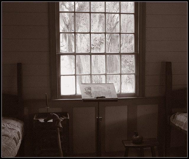
Personally I liked everything about this shot, including the beds others didnt care for. Most children practice their instruments in their bedroom so I found the setting perfect.
I could just see a child practicing away while looking out the window dreaming of his or her recital. This photo told more of a story than any other in the challenge. Personally I think it should have been top 15 easy. :) |
|
 Photographer found comment helpful. Photographer found comment helpful. |
Comments Made During the Challenge  |
|
|
08/17/2003 08:36:01 AM |
|
Without the title and challenge, this is a good photo on its own, though the window is a bit too bright. The tones are overall very nicely done and the crop is good. I don't like the bed in the shot, as it takes away from the "recital." |
|
| Photographer found comment helpful. |
|
|
08/16/2003 07:29:20 PM |
|
On the one hand, between the titleand the look of the piece, I don\'t really feel like this is \"inside looking out\" but rather \"inside looking inside\", with the \"out\" merely a backdrop. On the other hand, it\'s a very pretty backdrop and the scene is well-composed, the light sufficient to show most details inside in spite of the outside\'s glare. |
|
| Photographer found comment helpful. |
|
|
08/16/2003 07:03:05 PM |
|
I'll bet this picture is a lot more interesting than I'm seeing, but it is too dark to make out the objects of the interior. I think you need more light in the room or a little flash to bring it out. |
|
| Photographer found comment helpful. |
|
|
08/16/2003 01:32:08 PM |
|
Perhaps a crop closer to the window and the music stand to make the window more of the subject. The other objects are rather distracting. Good try =) |
|
| Photographer found comment helpful. |
|
|
08/13/2003 09:35:03 AM |
|
I just love the way you can still see everything outside the window in detail as well as everything in the room. Not easy to do! |
|
| Photographer found comment helpful. |
|
|
08/12/2003 11:36:46 PM |
|
Really nice use of light and contrast. I can just imagine the musician practicing while looking out into a beautiful garden. I like the title too. |
|
| Photographer found comment helpful. |
|
|
08/12/2003 03:08:32 AM |
|
IT READS DARK.PERHAPS SOME EASIER TO SEE MUSIC ON THE STAND.THE CANE IS NICE, BUT HARD TO SEE. NOT SURE ABOTU THE BEDS, ESPECIALLY THE ONE ON THE RIGHT. |
|
| Photographer found comment helpful. |
|
|
08/11/2003 10:36:24 AM |
more light in the foreground or more detail would have helped this but the almost watercolor effect of the tree outside the window is wonderful
title isn't clear to me |
|
| Photographer found comment helpful. |
|
|
08/11/2003 12:36:49 AM |
|
A little dark, but great composition otherwise. Terrific idea & very creative! |
|
| Photographer found comment helpful. |
Home -
Challenges -
Community -
League -
Photos -
Cameras -
Lenses -
Learn -
Help -
Terms of Use -
Privacy -
Top ^
DPChallenge, and website content and design, Copyright © 2001-2026 Challenging Technologies, LLC.
All digital photo copyrights belong to the photographers and may not be used without permission.
Current Server Time: 07/02/2026 07:00:21 PM EDT.