| Author | Thread |
Comments Made During the Challenge  |
|
|
05/09/2006 10:44:05 PM |
|
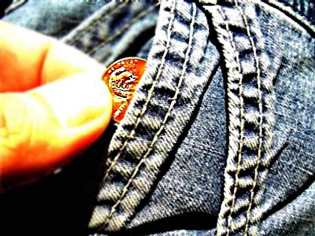
I think if this were sharper it would be better. And the colors just don't look right. |
|
|
|
05/09/2006 10:33:57 PM |
|
You have a good idea here but the photography needs some work. Keep trying. There are some excellent elements to this composition. |
|
|
|
05/09/2006 05:07:11 PM |
|
I think the penny is a little bit out of focus or something. I nice idea though. |
|
|
|
05/09/2006 04:06:04 PM |
|
Color adjustment on image was too far in the yellow zone. Contrast on jeans is really good though. Your penny seems a bit too sharp, though. You might have oversharpend to make the jeans really show texture, but at the expense of the penny, as well as too much contrast which shows up in the fingers. |
|
|
|
05/08/2006 02:51:54 PM |
|
lighting on the jean is perfect. Unfortunately, the hand is too hot takes too much attention away from the rest of the picture. |
|
|
|
05/08/2006 12:25:58 PM |
|
My favorite of the "money shots". It looks like there is a lot of post-production processing but I think it works well in your image. |
|
|
|
05/08/2006 03:25:06 AM |
|
I don't think I need to point out that this image is technically a wreck, but I'm glad you didn't post the typical image of a cat/dog/baby/flower |
|
|
|
05/07/2006 02:38:28 AM |
|
|
|
05/04/2006 11:48:57 AM |
|
This would really be a GREAT image if the fingers were not so blown out and didn't have such a funny color cast. Great idea. |
|
|
|
05/04/2006 04:30:57 AM |
|
Nice pic. The fingers in the foreground is a little bit too blown out for me though. Good luck with the next challenge! |
|
|
|
05/03/2006 11:12:30 PM |
|
I really like this image, The conflicting angles work extremely well. The only problem I see is the loss of focus inthe upper right and the fingers, as well as the fingers seem to get washed out in the upper areas. |
|
|
|
05/03/2006 10:35:34 PM |
|
i love that the fingers are out of focus. |
|
|
|
05/03/2006 06:12:44 PM |
|
i like that high saturation and over sharpness... in this case, i think that it adds to the image |
|
|
|
05/03/2006 01:39:14 PM |
|
Harsh light on fingertips, also looks oversharpened. |
|
|
|
05/03/2006 08:16:56 AM |
|
Overexposed on the fingers, nice idea though |
|
|
|
05/03/2006 07:27:48 AM |
|
Great colors... Nice picture... Good luck :o) |
|
|
|
05/03/2006 07:17:48 AM |
|
you might have been going for this particular style of pp - if so, please ignore my comments... for my tastes, the fingers are a bit blown - great idea and certainly meets the challenge. |
|
|
|
05/03/2006 01:23:02 AM |
|
Too much contrast/saturation, not enough focus. |
|
|
|
05/03/2006 01:00:59 AM |
|
nice high contrast and concept |
|
Home -
Challenges -
Community -
League -
Photos -
Cameras -
Lenses -
Learn -
Help -
Terms of Use -
Privacy -
Top ^
DPChallenge, and website content and design, Copyright © 2001-2026 Challenging Technologies, LLC.
All digital photo copyrights belong to the photographers and may not be used without permission.
Current Server Time: 06/28/2026 08:30:15 AM EDT.