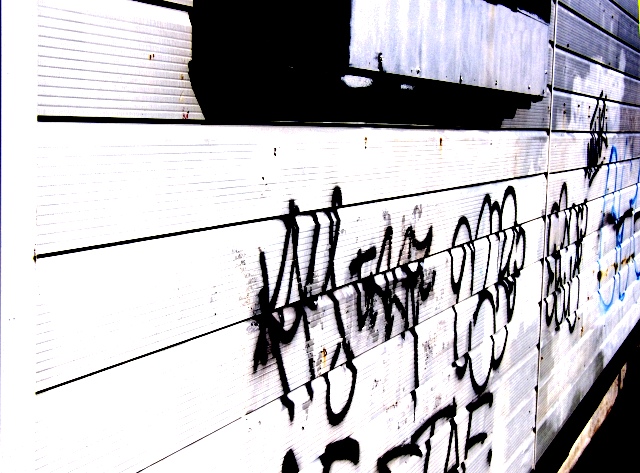
This is a bad pic .... tagging on the walls of an old bottle store ... I like it though. I pumped the contrast lots and removed the bright to make it arty.
Statistics
Place: 205 out of 288 Avg (all users): 5.0245 Avg (commenters): 4.8333 Avg (participants): 4.6386 Avg (non-participants): 5.2222 Views since voting: 717 Views during voting: 310 Votes: 245 Comments: 10 Favorites: 0
Well, when you start by saying yourself "this is a bad pic"... ;)
I hadn't seen which challenge this was an originally wondered if it was for rhythm with the repeated lines. Being cliche, I think the perspective angle you took is too severe. The A/C unit, or whatever that thing is, is distracting and the tagging isn't even that pretty. (apparently you need some more talented vandals around your area.)
I'm guessing you knew this would score like this going in. I call that dead pixels walking. No amount of PP is going to save a picture that is uninspired to begin with. You made an attempt with the boosted contrast trying to give a edgy urban feel, but it wasn't up to the task. With this picture in mind, I suggest working more on subject choice. Look for something that grabs the eye in its unusualness, shape, texture, etc....
"The writing is on the wall ..." is an interesting addition into the Cliches and Sayings challenge. Very good choice on subject and matching it up with your title.
The overall image does give off a harsh feel, but very appropriate for the title. I really do like the sharp angle to you took to put a different slant on the graffiti. Obviously from the shot and your comments you wanted a high contrast shot. I would have done the same thing to give it an edge. You wouldn't want to shot to be soft, but to really let the writing pop. This look like a tough shot, I might try cropping it so that the black triangle at the bottom isn't so distracting. I do like the include of the box on the upper part to give the image more dimension.
Overall good work, I think you really created an image that grabs attention and defiantly illustrates the title. I look forward to your future entries.
Image is overexposed making the entire piece look overwhite. Might need to use a higher shutter, or perhaps a polarizer to even out the lights and darks.
Good angle and choice for title. The box on the top corner is throwing me off balance a bit, but that may just be personal taste. Keep up the good work!






 Add photograph to your favorites
 Add photographer to your favorites

 Photographer found comment helpful.


