| Author | Thread |
Comments Made During the Challenge  |
|
|
08/19/2003 11:22:09 PM |
|
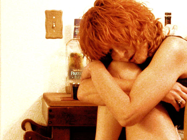
nice portrayal...i like the grain...and the color...and the diagnal of lines created by her arm, eyes, lips , position of bottle and table, and the slight shadow on the wall...flows well...good composition. |
|
 Photographer found comment helpful. Photographer found comment helpful. |
|
|
08/18/2003 07:17:42 PM |
|
wow. Very sexy ... and desolate. :) Jacko. 9 |
|
| Photographer found comment helpful. |
|
|
08/18/2003 05:49:16 PM |
|
I have been staring at this photo for a few minutes just wondering about the colors. Everything in here is the same hue! Orange! Her hair, her freckles, the table, the bottles. I think that it is all the natural colors and it is very wonderful. I love the composition. Love it. :) |
|
| Photographer found comment helpful. |
|
|
08/18/2003 08:07:40 AM |
|
I really like the composition of this shot. I would have rated it higher if it were a little less bright. |
|
| Photographer found comment helpful. |
|
|
08/17/2003 09:17:05 PM |
|
The booze bottles and glass in the background are an awesome touch of detail in this one. This is so far the best example of the sadness interpretation of desolation that I've seen. Oh and I have a weekness for redheads! ;-) |
|
| Photographer found comment helpful. |
|
|
08/17/2003 06:54:46 PM |
|
I really like tint in this photo. The subject is great and the background really adds to the feeling. I feel like the lighting might be a little harsh and it could be a little more in focus. Great job though! |
|
| Photographer found comment helpful. |
|
|
08/14/2003 03:58:14 PM |
I can see the idea behind this but I personally don't think it's been pulled off as well as it could have been.
I find the background very distracting.
I don't like the strong orange tone.
The decision on which parts of her arms/ legs/ hands are included and which aren't seems a little abitrary.
The image seems unsharp.
That said the idea itself is a nice one.
3 |
|
| Photographer found comment helpful. |
|
|
08/14/2003 12:01:48 PM |
|
I love this picture! The noise in it adds to the "desolation" feeling. Great job!! :) |
|
| Photographer found comment helpful. |
|
|
08/14/2003 02:36:49 AM |
|
love the dead space to the left... very nice |
|
| Photographer found comment helpful. |
|
|
08/13/2003 07:59:47 PM |
|
I think the raw gritty feel to this one helps communicate desolation. The wall on the back is harsh and normally I'd comment that its overexposed but it fits here. This piece evokes emotion and tells a story. |
|
| Photographer found comment helpful. |
|
|
08/13/2003 06:03:54 PM |
|
the emotion in this is clear and strong |
|
| Photographer found comment helpful. |
|
|
08/13/2003 11:33:58 AM |
|
good shot... really captures the mood |
|
| Photographer found comment helpful. |
|
|
08/13/2003 11:31:07 AM |
|
nice idea.. but .. too much color, too much grain.. try it in b/w, more contrast.. something more dramatic.. |
|
| Photographer found comment helpful. |
|
|
08/13/2003 08:26:09 AM |
|
I have a feeling this photo won't get the placing it deserves, but I hope I'm wrong. The highlights are blown out, the picture is noisy, the skin tone is unflattering, there's an orange colour cast, it's blurry... but I LOVE all these things! They look intentional to me, and it creates a very effective mood. Your model is great, very photogenic and just right for this shot. I think the red hair and freckles give a waif-like vulnerable feel to her. 8 |
|
| Photographer found comment helpful. |
|
|
08/13/2003 06:45:12 AM |
|
| Photographer found comment helpful. |
|
|
08/13/2003 01:20:40 AM |
|
Too grainy & cluttered on the right half. Good idea, though. |
|
| Photographer found comment helpful. |
Home -
Challenges -
Community -
League -
Photos -
Cameras -
Lenses -
Learn -
Help -
Terms of Use -
Privacy -
Top ^
DPChallenge, and website content and design, Copyright © 2001-2026 Challenging Technologies, LLC.
All digital photo copyrights belong to the photographers and may not be used without permission.
Current Server Time: 06/28/2026 04:28:05 AM EDT.