This is a type of photojournalism that is less popular than most other types. This is called a photo illustration. Photo illustrations differ from most other forms of photojournalism in the fact that they are contrived rather than candid. Most reputable photojournalists have these images labeled as photo illustrations in print as well. The cut line with the image will have the context followed by "Photo Illustration by John Doe." I notice that a couple of your comments don't see this piece as photojournalism. A more mainstream type of photojournalism may have fared better here on DPC. Everyone likes to talk about being 'outside the box' but when they vote, they don't give that much leeway from their own interpretation of the theme.
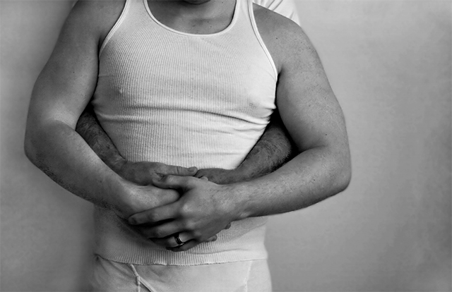
As for the image itself, it does support the theme you chose to represent. I think that it could have been stronger though. When I first looked at the image, I had to look fairly closely to catch your theme. The fact that there are two people in the photo is not dominant in the composition. In a photo illustration, or any photojournalistic image for that matter, the theme needs to be dominant and jump out at the viewer. As I look more closely at your image, I can see that you have dodged out the ring area on the hand to draw attention to it, but it's not a strong enough focal point within the context of the entire image to make your point with strength. If you wanted the ring to be the center of attention, it may have been worthwhile to do a photo that focused on two men's hands rather than the embrace. This theme has lots of possibilities.
Photo illustrations are a lot like still life photography. Since the photographer has all the control of the scene, situation, and lighting, There should be no issues that come up short. Everything should be perfect, and there is no excuse for it not being. Personally, this is one thing I take into consideration when voting or critiquing a shot of this nature. The technical standards are much higher in this situation.
Subject choices also play a role in the results you get on this site. There are some subjects that touch nerves and create reactions that have nothing to do with the image itself. You always have to be prepared for those votes...
"I know the background bothersome- but i got to a point where I did not want to mess with it anymore."
Giving up shouldn't be an option. If you commit to the task, you should give it the time and effort it deserves. If you fail, you may want to consider not submitting it. If you aren't completely happy with the result, how would you expect anyone else to be?
Really a nice image. Maybe not for photojournalism per se, but I do like the arms/torso approach you took. Nice in black and white too. It neutralizes any color variations and you just concentrate on the shadows and lights. The slightly off centered composition is one of my favorites.
I think showing the two men's faces would have had more of an impact because it shows they aren't trying to hide from the public, but a great a idea and just a suggestion
Uh oh!! I can just imagine the comments you are getting over this one. Very brave...and no...I am not going to lower my vote because of my own beliefs. Good work.
geat idea but maybe could have been done better. maybe thier two faces next to each other or just two hands and hairy arms. of course with this subject matter you have to be carefull if you are putting this in a aminstream publication. the weding ring is a nice touch. 8






 Add photograph to your favorites
 Add photographer to your favorites

 Photographer found comment helpful.


