Author Thread
Post actions
Hey there from the Critique Club
Post actions
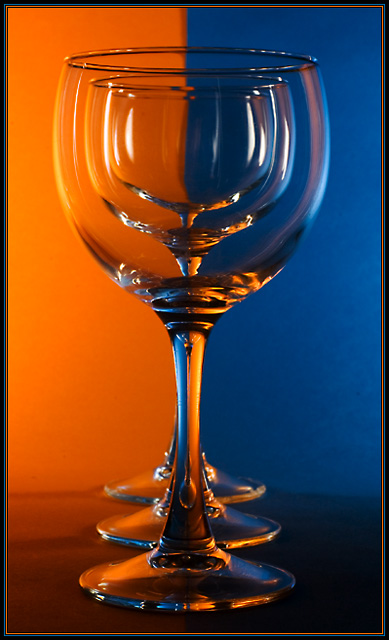
Nice colors and composition. If you would have avoided reflection, this would have scored even higer.
Comments Made During the Challenge
Post actions
OOO I like this alot, someone teach me how to do this damn it 8
Post actions
Well executed. Nice border.
Post actions
Technically very good, but this way of treating glass has become somewhat a cliche and leaves me a bit cold, to be honest.
Post actions
Post actions
Very nice, the three glasses behind each other give an interesting effect.
Post actions
Love the technique, but I think I have seen too many of these from past challenges.
Post actions
Post actions
Post actions
Good variation on a shot that has become popular.
Post actions
good spin on an old classic...maybe if the background was a bit brighter it might pop more
Post actions
nice shot. Love the leading lines.
Post actions
very much done in this challenge yet i dont like this one its too dark IMO so i have to devalue it even more.
Post actions
Brilliant Picture. Well done!
Post actions
I love the lighting here, I'm guessing some will winge about 'another glass shot..." but a good photo is a good photo. I just wonder what it would have looked like with water in the glasses, did you try it?
Post actions
love the glasses and how you used them in this shot
Post actions
Nice perspective, I would have liked to see this a bit brighter.
Post actions
great idea and composition. doesn't seem crisp enough.
Post actions
great refrcation exercise ;) the receding ines are a great value to this image ;)
Post actions
Nice effect, looks like a high scorer to me.
Post actions
very elegant... I may have enjoyed it more with a crop above the stem of the first glass
Post actions
Too cliche on DPC, but techinically good job.
Post actions
You should have glued the paper on the wall. A small distracting shadow from it ruins a bit.
Post actions
Glasses and backgrounds are very popular here on DPC.
Post actions
Post actions
it's is a nice picture only the idea is not original anymore. to bad for te lack of improvisation
Post actions
Post actions
Another magical image.....
Post actions
Nice. A bit to symmetrical for me, but nice, and I can see this was a lot of trouble... did you wear gloves? :-)
Post actions
This is a mini-Tutorial on the concept! 10
Post actions
Nice composition. Needs a bit more light though.
Post actions
Post actions
nice...but lighting is a little flat
Post actions
5 - Meets the Challenge, just.. the concept is becoming commonplace so the impact is less, especially so close after the Refraction Challenge. So a bit of a risky entry, having said that, to take such a risk with a concept such as this has to be a 'special shot' and this just needs some further refinement, and also, as mentioned, something to give it an edge, in my opinion.
Post actions
That makes 4 of this type of shot and 3 have been with orange and blue! Still, they manage to retain some individuality. Good photo.
Post actions






 Add photograph to your favorites
 Add photographer to your favorites


 Photographer found comment helpful.


